
User Experience Icon: Custom UX and UI Icons from One Prompt
Stock libraries answer a user experience icon search with thousands of near matches, none of them in your palette. Describe the concept instead: one sentence becomes a 1024 px UX icon in your own colors, with variants to compare, small-size checks, and every export format your project needs.
Icon Examples in Every Style
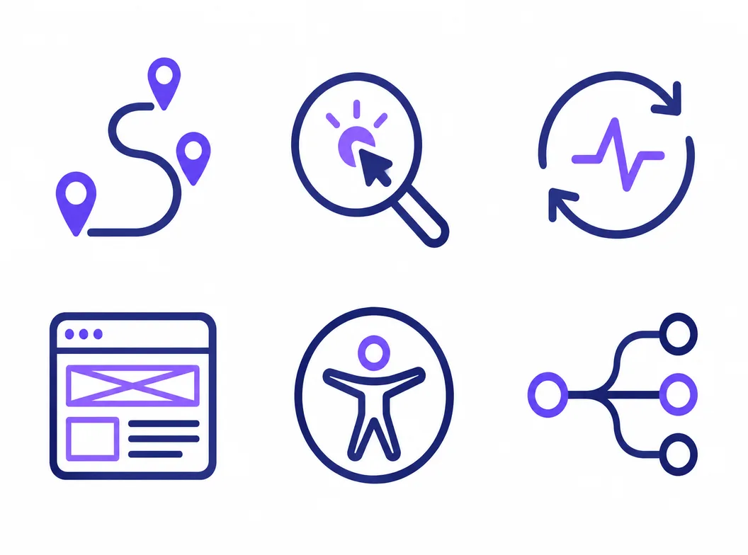
Finished marks from the generator, from flat user experience icons to 3D takes, each holding its silhouette from the 1024 px master down to a 16 px favicon.


What Is a User Experience Icon?
A user experience icon is the small mark that stands for a UX concept: a journey map, a usability session, a feedback loop, an accessibility check. It is one member of a family rather than a lone symbol, which is why grabbing a single stock icon so often looks off next to the rest of a page. Name the concept, generate candidates at 1024 px, and judge them at the sizes these marks will really render.
One concept per mark
A journey map icon that also hints at analytics reads as neither. The strongest UX icons name one concept each and let the set, not the single mark, carry the story of a page.
Labels carry the meaning
The Nielsen Norman Group's icon usability research finds that only a handful of icons, such as home, search and print, are understood without a label. Plan every user experience icon as a mark and label pair, especially in feature grids.
Every take stays on the canvas
Each generation lands as a node with its prompt attached, so you can branch a direction, compare takes side by side, and reopen last week's session without redoing work.
How to Create a User Experience Icon in 3 Steps
From a one-line UX concept to a master file that covers the feature grid, the case study and the favicon.
- 1
Name the concept and the style
Write one sentence that names the UX concept, the style family and the palette, like "rounded line user experience icon, journey map with pins, indigo on white, readable at 16 px". The sharper the silhouette you describe, the fewer rounds you need.
- 2
Generate, then judge small
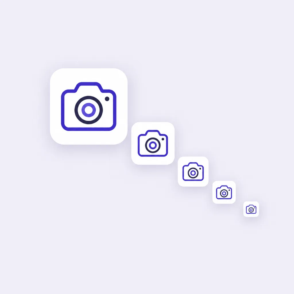
Candidates arrive at 1024x1024. Switch to the 48, 32 and 16 px previews before choosing, because thin strokes and crowded detail only reveal themselves at the sizes user interface icons really render.
- 3
Lock the family, export everywhere
Keep the winner's style words for the rest of the set, attach it as a reference image so later marks follow its look, then export PNG, ICO and WEBP cuts from one master for web, decks and product UI.
User Experience Icon Prompt Examples
Copy any of these into the generator, then swap the concept for your own. A strong UX icon prompt names three things: the concept, the style family, and the palette with its background, because those three decide how the mark sits beside its label.
Journey map mark
rounded line user experience icon, journey map path with three pins, indigo on white, uniform 2 px stroke, readable at 16 px, no text
Usability test mark
flat UX icon, magnifier over a tap target, two solid colors on off-white, generous margins, crisp at 24 px, no text
Feedback loop mark
minimal UI design icon, circular feedback loop with a pulse line, teal on white, open negative space, crisp at 24 px, no text
Three Ways to Source User Experience Icons
A stock library, an open-source set and an AI generator all end at a folder of files. They differ in license terms, in whether the marks match your system, and in what happens when the next concept is missing from the collection.
| Stock icon libraries | Open-source icon sets | AI icon generator | |
|---|---|---|---|
| Where the icons come from | Marketplaces listing thousands of premade user experience icons | Curated libraries like Myna UI, Lucide and Tabler, shipped through npm and Figma | Your prompt: concept, style family and palette in one sentence |
| License | Varies by plan; free tiers often require attribution | MIT: free for personal and commercial use, keep the license file | Commercial rights to every icon you generate |
| Brand fit | Closest match wins; palette and stroke weight rarely line up | Consistent but generic: the same sets appear across the web | Generated in your palette and weight to match the design system |
| UX concept coverage | Broad but uneven: many results, few that read at 16 px | Interface chrome is covered; research marks like journey maps are rare | Any concept you can name, including niche UX and research marks |
| Adding the next icon | Search again and hope a lookalike exists in the same set | Request it, wait, or draw it yourself | Generate it with the same style words and a reference image |
| Cost at set scale | Subscription or per-icon packs, repeated yearly | Free, paid in integration time | Credits per generation, free credits to start |
Comparison of typical ways to source UX icons, checked against library pricing pages and open-source licenses as of 2026.
What the Generator Handles for You
Everything between the first sentence about a UX concept and a master file that drops into the layout.
Marks in your palette
Name your colors in the prompt and the candidates arrive in them, so the mark sits in the feature grid without a recoloring pass.
Reference-image matching
Upload one approved mark and new generations follow its look, which keeps the whole UX icon family inside the style you already signed off.
Takes on one concept
Branch a mark into weight, palette and style versions, compare them side by side, and keep the winner without losing the runners-up.
Small-size checks
Preview every candidate at 48, 32 and 16 px, the sizes where user interface icons fall apart next to their labels.
Exports for every surface
PNG, ICO and WEBP from one master, with transparent backgrounds for layout work and solid cuts for buttons and badges.
A workspace that remembers
Generations stay on the canvas with their prompts, so a UX icon set started today can continue next week exactly where it stopped.
Where Myna UI Icons and Other Open-Source Sets Fit
Open-source libraries are the right first stop for interface chrome. Myna UI icons ship more than 2,500 MIT-licensed marks built for Tailwind CSS, shadcn/ui and Figma, and Lucide and Tabler cover the same ground for user interface design icons: settings, arrows, file actions, the rows of user interface icons every product needs. They are generic by design. The moment a surface asks for concept marks in your palette, a UX feature grid, a case study diagram, a service page, browsing a library cannot produce a matched family. The working rule: chrome from the open-source set, concepts from the generator, one stroke weight across both.
Interface chrome from open source
Install @mynaui/icons or lucide and the everyday actions are covered: menus, toggles, chevrons, search. MIT licensing keeps them free for commercial products.
Concept marks from the generator
A journey map, a usability session, a feedback loop: name the concept and the palette, and the mark arrives matched to the system your chrome already uses.
One weight across both sources
Generate your UX marks in the same stroke weight as the open-source family, and a mixed icon row reads as one design system instead of two.
Related Workflows
One generator behind every icon a project ships, from the design concept to the browser tab.
The full icon design workflow
Concept, silhouette and small-size testing for marks that must survive every surface.
Graphic icon design
Small graphic marks for decks, packaging and wayfinding, in the project's own palette.
Feature grids of eight
A consistent set of 8 icons for the landing page, one prompt family.
A matched family for the brand
Take the design language across the app, site, deck and support pages.
Favicon and web cuts
favicon.ico, apple-touch-icon and the PWA sizes from the same master.
Resize a finished square
Cut an existing 1024 px icon into every store and web size, free and local.
Related Tools
Blog
Further Reading
Longer reads on icons, styles and export workflows.
User Experience Icon FAQ
What a user experience icon covers, where to get UX and UI icons, and the questions designers ask before generating.
What is a user experience icon?
It is a small mark that stands for one UX concept: a journey map, a usability session, a feedback loop, an accessibility check. These marks appear on feature grids, case study pages, service listings and design system docs, usually as a mark and label pair. The mark belongs to a family that shares stroke weight, palette and corner style, which is what separates a designed set from a folder of mixed stock finds.
Where can I download user experience icons for free?
Three routes. Free tiers of stock libraries like Flaticon and The Noun Project offer UX icon downloads with attribution rules and daily caps. Open-source sets like Myna UI icons, Lucide and Tabler are MIT licensed and free for commercial use. Or describe the concept in the generator above: it starts with free credits and returns custom marks in your palette instead of premade files.
How do I create a user experience icon with AI for free?
The generator above starts with free credits: name the concept, the style family and the palette in one sentence, generate the first candidates, and check them at 16 px before paying anything. Further generations use credits, and every plan includes all styles and export formats.
Are Myna UI icons free to use?
Yes. Myna UI icons are open source under the MIT license, more than 2,500 marks built for Tailwind CSS, shadcn/ui and Figma, so personal and commercial projects can use them without fees or attribution. Keep the license file in your repository, as with any MIT package. They cover interface chrome well; for concept marks in your own palette, generate them here.
What makes a good user experience icon?
One concept per mark, because a mark that means two things reads as neither. A silhouette simple enough to survive 16 px. A stroke weight that matches the type beside it, and a palette drawn from the brand rather than beside it. Most weak UX icons break one of those four, not all of them.
Should a user experience icon have a text label?
Almost always. Research on icon usability by the Nielsen Norman Group finds that only a few icons, home, search and print among them, are consistently understood without text. In feature grids and service pages, pair every mark with its label and let the icon speed recognition rather than carry it alone.
What sizes does a user experience icon need?
Product UI renders user interface icons at 16, 24 and 32 px, decks and case studies at 64 to 128 px. Generate the master at 1024x1024, judge it in the 48, 32 and 16 px previews, then export the sizes each surface needs from that one master.
How do I match UX icons to my brand palette?
Name the colors in the prompt itself, hex values or plain color words, and the candidates arrive in them. That beats recoloring a stock mark later, which breaks anti-aliased edges. For a full set, generate one approved mark first, then upload it as a reference image so every later icon follows the same palette.
Can I use AI-generated UX icons in commercial projects?
Yes. You keep full commercial rights to every icon you generate, subject to the terms of service, including marks used in client work, shipped products and paid campaigns.
What file formats do UX icons need?
PNG with transparency for layout and web work, WEBP for lighter delivery, and ICO when the mark doubles as a favicon. The master is 1024x1024 and every smaller cut comes from it, so print-adjacent use in decks and one-pagers stays sharp.
Start Your User Experience Icon
Describe the UX concept in one sentence, generate it in your palette, check it at 16 px, and export every cut your project needs.