
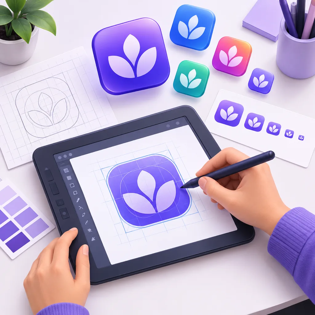
How to Design Icons: Principles, Workflows and Sizes
How to design icons: the short version
Learning how to design icons comes down to one discipline repeated at every step: draw for the smallest size the icon will ever occupy. An icon is not a small illustration. It is a signal that has to survive 16 px browser tabs, 24 px toolbars, 48 px home screens and 512 px store listings, usually from the same file. Every rule below exists because of that constraint.
The short version: pick one subject, reduce it to a bold silhouette, draw it on a consistent grid, keep the finish uniform across the set, and export platform sizes from one master. The long version is the rest of this guide, including three workflows that get you there (manual vector work in Illustrator or Figma, template tools, and AI generation) and the steps for putting a finished icon on an iPhone, an Android device or a website.
What makes a good icon?
Before touching any tool, it helps to know what you are aiming at. Apple's Human Interface Guidelines and Google's Material Design guidance state most of these tests directly, and working designers apply the rest by habit:
- Silhouette first. Squint or blur the icon. If the shape is still recognizable, the design works; if it turns into a blob, no amount of detail will save it.
- One subject, one idea. A good icon says one thing. Combining a shield, a checkmark and a rocket in one glyph says nothing clearly.
- Consistent corner radius and stroke weight. Rounded corners everywhere or sharp corners everywhere, thick outlines everywhere or none. Mixing finishes inside a set reads as an accident.
- Aligned to a grid. Keylines keep padding predictable so a folder of icons looks like a family. Material Design publishes a 24 dp keyline template for exactly this reason.
- Details that survive reduction. A face needs eyes and maybe a mouth. It does not need eyelashes at 24 px.
Favicons deserve a special mention here, because they sit at the extreme end of the size range. What makes a good favicon is an even stricter version of the same list: one letter or one simplified mark, high contrast against both light and dark browser chrome, and no text smaller than the initial of your name.
Three ways to make icons, and when to use each
There are three practical routes to a finished icon set, and the best app for creating icons is whichever one matches your volume, your budget and how custom the result needs to be.
Manual vector work (Illustrator, Figma, Inkscape). This is the craft route. You draw shapes on a grid, align everything to keylines, and control every curve. For example, learning how to make a person icon in Illustrator means building a circle for the head, a rounded trapezoid for the shoulders, and deciding once how thick the shared outline is. Vector work gives you pixel-perfect control and infinitely scalable SVGs, which matters when a set has to hold together across hundreds of glyphs. The cost is time: a coherent set of twenty icons is days of work, and the skill ceiling is real.
Template and clip-art tools (Canva, icon libraries, icon fonts). Libraries like Material Symbols, Lucide or Font Awesome give you thousands of consistent glyphs for free, and template tools let you recolor and compose them. For standard metaphors like a trash can, a gear or a magnifier, this is the fastest correct answer, and there is no shame in it: users recognize the standard forms faster than your custom variant. The limits show when you need a subject nobody has drawn yet, or a visual style that belongs to your brand alone.
AI generation. A AI icon generator sits between the two: you describe a subject and a style in text, the model renders original artwork, and you export a square master with a transparent background. It is the only route that produces a new drawing from a description, which makes it the practical choice for product mascots, unusual subjects, or style-driven sets (an emoji-flavored set, a neon set, a claymorphism set) without hand-drawing each glyph. The trade-off is less per-curve control, so it rewards clear prompts and a willingness to regenerate.
How to design icons with AI: a working workflow
AI generation collapses the drawing step but not the design decisions. The workflow that consistently produces usable icons looks like this:
1. Write the brief before the prompt. One subject, one style, one mood, one background decision. "Sleepy cat, emoji style, glossy, warm yellow, plain background" is a brief. "Cute cat icon maybe with some stars and a moon and soft colors" is a wish, and wishes produce mushy candidates.
2. Generate candidates, judge silhouettes. Render several options and evaluate them at small size first, the same squint test as manual design. A candidate that only works large is a rejection, not a starting point.
3. Keep the family coherent. If the set needs more than one icon, reuse the same style and finish words across prompts and generate in one session. Style presets help here: pinning a style means candidates differ by subject, not by rendering. The icon design page works this way for general styles, and an emoji icon generator pins the glossy emoji recipe for playful sets.
4. Export one master, cut the sizes. Work at 1024 px with a transparent background, then scale down per platform. Simple shapes survive reduction; photograph-like renders do not.
5. Compare against a reference set. Place your icons next to a mature library at the same size. Anything that draws the eye for the wrong reason, a stray gradient band or a broken silhouette, goes back for another run.
Icon sizes and formats that matter
The most common practical question is what is the best format for icons, and the honest answer is that each platform takes a different one. One 1024 px PNG or WEBP master covers every row of this table; you just cut it down per slot.
| Surface | Typical sizes | Format | Notes |
|---|---|---|---|
| Browser favicon | 16, 32, 48 px | ICO, plus PNG and SVG | ICO bundles multiple sizes in one file; SVG is increasingly supported |
| iOS app icon | 1024 px master | PNG, no transparency | Xcode and stores want the square master; iOS rounds the corners for you |
| Android app icon | 512 px store, 108 dp adaptive | PNG, WebP | Adaptive icons use separate foreground and background layers |
| Windows shortcut | 16-256 px | ICO | Same bundled-size logic as favicons |
| Chat emotes | 112-128 px | PNG or GIF | Discord, Slack and Twitch all want transparency and small files |
Two rules cover most mistakes. First, never upscale: a 16 px favicon cropped from a 1024 px master looks fine, while a 512 px listing image upscaled from 128 px looks broken. Second, mind transparency rules: iOS bakes its own corner mask and rejects transparent pixels, per Apple's icon guidelines, while chat platforms reject anything without them.
Where to get icons for your website
For a site, you have the same three sources as any project: a library, a designer, or generation. Libraries are fastest for standard UI glyphs. A designer makes sense for a brand mark with specific meaning. Generation fills the gap in between: a custom subject in your product's style, drawn in seconds. For the site icon specifically, the workflow ends at the favicon: a 1024 px master cut down to the ICO and PNG sets, which is exactly what the site icon generator and the favicon generator automate, checks included at 16 px where it matters most.
How to change your app icon design on iPhone and Android
Designing the icon is half the job; shipping it to the device screen is the other half, and the answer differs by platform.
iPhone (as a developer). iOS does not let apps replace their own icon at will. You ship the 1024 px master in the app bundle, and App Store Connect takes it from there; the system applies the rounded mask. You can offer alternate app icons, a fixed set the user can switch between from your app's settings, declared in the asset catalog.
iPhone (as a user). Without developer access, the Shortcuts app is the standard trick: create a shortcut that opens the target app, open its details, choose "Add to Home Screen", and assign any image as the icon. It works, with two caveats: the shortcut launches through a banner, and the original app icon still exists in your app library.
Android. How do I add an app icon to my Android home screen? Long-press the app in the drawer and drag it out, or long-press the empty home screen and use the Widgets and shortcuts menu. Some launchers support icon packs and per-shortcut icon editing: long-press the shortcut, tap Edit, and swap the image. Why is an app missing from the home screen? Usually it simply lives in the app drawer. Android only pins a handful of icons by default, and showing the icon on Android is a matter of dragging it where you want it.
Samsung. One UI follows the Android pattern, with the edit option living behind the long-press menu on the shortcut itself. Icon packs from the Galaxy Store change every icon at once if you want a coherent redesign without touching each shortcut.
Quick FAQ
Why is my app icon white or blank? On Android this usually means the app declares an icon resource the current launcher cannot render. A missing adaptive icon layer after an update is the classic case. Clearing the launcher cache or reinstalling the app fixes it. On the web, a blank tab icon means the favicon link tag points at a missing file.
Why does my app not have an icon at all? Side-loaded APKs and development builds often skip icon resources entirely. Store-distributed apps always declare one; if a listing shows without an image, the store listing itself is missing the asset, which is a developer console fix.
What app has a P icon, a T icon, an S icon? These queries are usually someone reverse-engineering a home screen. Single letters are most commonly custom Shortcuts icons on iOS or icon-pack substitutions on Android. The letter is the designer's stand-in, not a platform standard, so the only reliable answer is to open it.
How long does a good icon set take? A library pull takes minutes; twenty hand-drawn coherent icons take days; an AI-assisted set with a pinned style is a session's work, including the size cuts. The principles do not change between the three speeds; only the drawing step does.