
Icon for Mobile App: One Mark, Every Home Screen
Every installed app ends up in the same place: a 48 px square on a home screen, shoulder to shoulder with the icons of the world's biggest brands. An icon for a mobile app has to win that spot from one glance, then survive iOS masks, Android launchers and two store listings. Describe the subject, the style and the palette in one sentence and generate the 1024 px master both stores cut their assets from.
Mobile App Icons Generated from Text
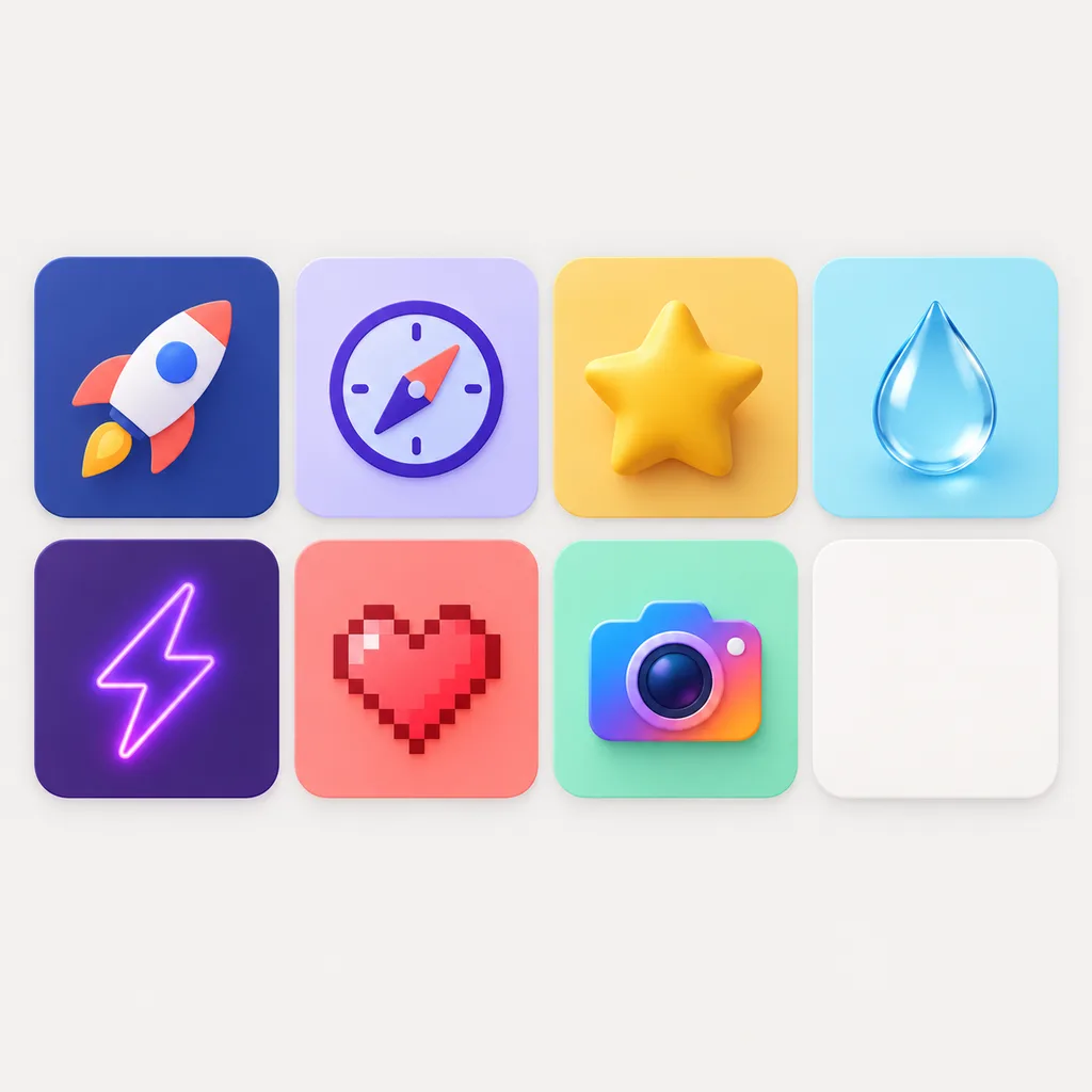
Finished marks from the generator, from flat utility icons to clay and pixel game icons, each one generated from a one-line brief and cut for the stores by its creator.


What Is the Icon for a Mobile App Called?
The naming confuses everyone the first time. Apple's documentation calls it the app icon; Android's calls it the launcher icon once it sits on the home screen, and adaptive icon when it is the two-layer format the device masks into shape; store listings call it the listing icon or store icon, which is a separate upload from both. In practice: you design one square master, the App Store derives its sizes from it, Google Play wants its own 512 px cut, and the launchers crop whatever they receive into circles and rounded squares. Design the mark for the crop, center it, keep the edges clear, and one drawing serves every name the platforms give it.
One master, every surface
The 1024 px square master feeds the App Store's single-size upload, Google Play's 512 px listing asset, and every smaller device size, so the brand matches across both stores.
Design for the mask, not the square
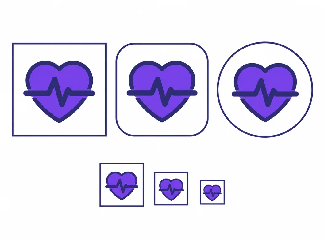
iOS applies its own rounded corners and Android launchers mask a two-layer icon into circles and squircles. A centered subject with clear margins survives all of them; art pinned to corners does not.
Judged at thumb size
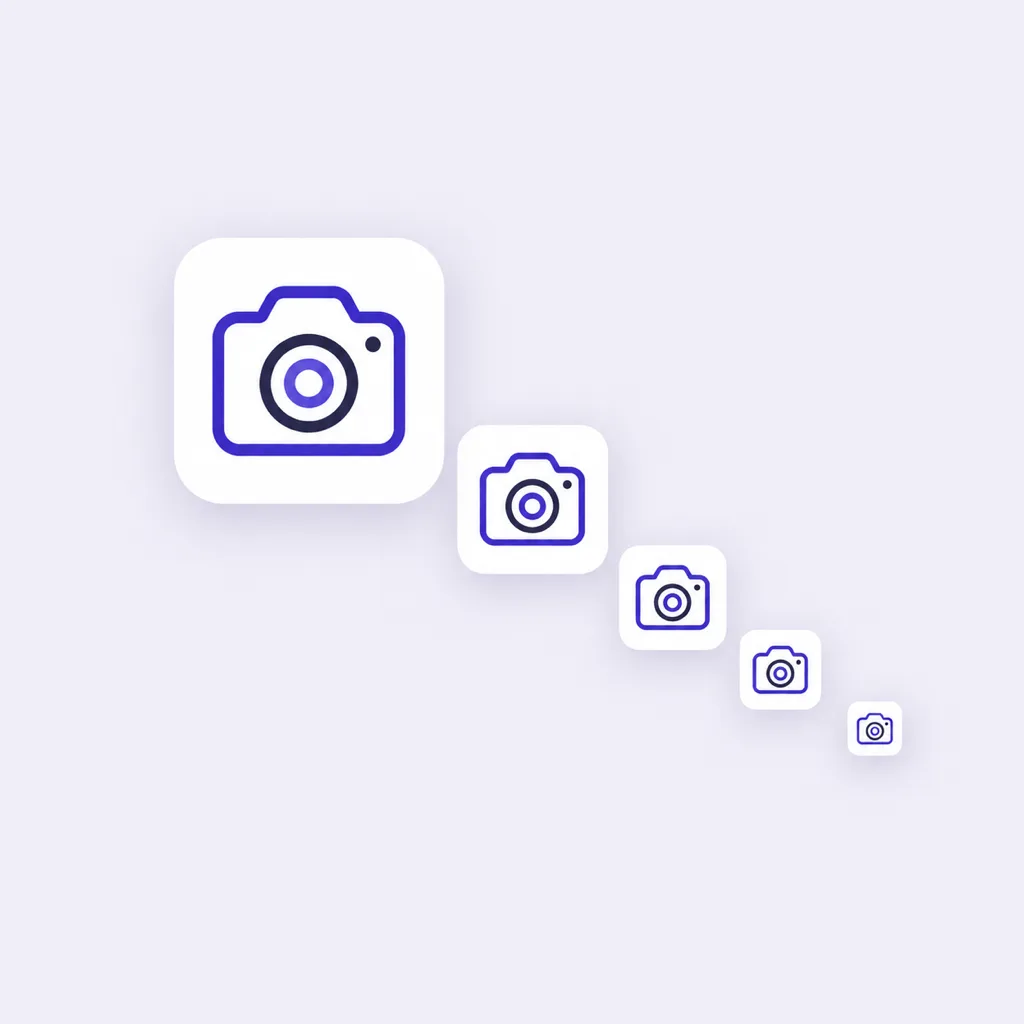
Users meet the icon at roughly 48 px among dozens of neighbors, long before they see the store screenshot. Every candidate here can be previewed at exactly that size before you commit.
What Makes a Good Icon for a Mobile App
What separates a strong icon for a mobile app from a weak one comes down to four checks, and store rejections cluster around the last one. Run every candidate through them before shipping.
One subject, one silhouette
A single object the eye resolves in one glance: a heartbeat line, a coin stack, a pan. Icons that list three features inside 48 px read as noise, and noise does not get tapped.
Contrast against the wallpaper, not just white
Home screens sit on photos and dark modes. A mid-gray mark on a white canvas disappears on a busy wallpaper; strong figure-ground contrast keeps the icon findable everywhere.
No words, no thin detail
Text below 48 px turns to smudge, and hairline strokes dissolve on low-density screens. Say it with the silhouette; save the wordmark for the store listing.
Full square, no pre-drawn corners
Apple rejects icons with baked-in rounded corners or alpha transparency, and Google Play rejects pre-rounded artwork too. Ship square, edge-to-edge artwork and let every surface apply its own mask.
Distinct from the neighbors
Search your category in the store and look at page one. If your candidate reads as a cousin of the top three, the silhouette needs another branch, not another color.
Readable at 16 px
Settings screens and notification lists shrink the icon further. The 48, 32 and 16 px previews in the generator catch the marks that only work large.
How to Make an Icon for a Mobile App in 3 Steps
From a one-line brief to a store-ready icon for a mobile app on both platforms.
- 1
Describe subject, style and palette in one sentence
Like "icon for a mobile fitness app, heartbeat line in a rounded square, coral on cream, flat, readable at 48 px, no text". A sentence that names those three things and bans text usually lands usable candidates on the first round.
- 2
Generate, branch, judge at 48 px
Candidates arrive at 1024x1024. Branch the promising ones into palette and style variants, then open the small-size previews, because the home screen is where the icon lives or dies.
- 3
Export both stores' cuts from the master
Keep the winner as the 1024 px square master, export the opaque PNG for the App Store and the 512 px cut for Google Play, and reuse the same mark for the adaptive layers so the brand matches on every device.
Three Ways to Get an Icon for a Mobile App
Search results offer ready-made packs, resizing tools and generators. They solve different halves of the job, and most app teams end up needing both halves from one place.
| Ready-made icon packs | Icon resizers | AI icon generator | |
|---|---|---|---|
| What you start from | A stock icon someone else designed, in a fixed palette | An image you already have, any source | Your brief: subject, style and palette in one sentence |
| Looks like your app, not everyone's | No: the same file is licensed to other apps, and category cousins are common | Only if the source image already fits the app | Yes: each generation is a new drawing made from your concept |
| Store-ready outputs | Whatever the pack ships, usually PNG and SVG in fixed sizes | Every iOS and Android size from one upload, but no new artwork | 1024 px master plus the store cuts, with small-size checks first |
| Store rule compliance | Not screened: alpha channels and pre-drawn corners appear in packs | Handled: exports follow each platform's size list | Handled: opaque square masters with no baked corners, by design |
| Reworking after feedback | Pick a different stock icon and start over | Re-run the same source; the weaknesses come along | Branch the same concept into new palettes and styles in minutes |
| Cost profile | Subscription or per-pack | Free to a few dollars per batch | Credits per generation, with free credits to start |
Comparison of typical routes to a mobile app icon, based on the tool categories ranking for the query as of 2026.
Mobile App Icon Prompts That Work
Copy one and swap the subject for your own. A prompt that lands store-ready icons names three things: the subject, the style with its background color, and a readability target, and it bans text explicitly.
Utility app
icon for a mobile budgeting app, coin stack with one rising coin, deep indigo field, flat, bold silhouette, readable at 48 px, no text
Content and social app
icon for a mobile podcast app, microphone with a play triangle, warm red on cream, rounded shapes, centered subject, no text
Game app
icon for a mobile puzzle game, glossy treasure chest with gold coins, saturated 16-bit inspired palette, clay shading, no text
One Brief, Every Surface the App Meets
The winner does not stop at the master. The same mark is judged at home screen size, cut for the App Store and Google Play, and kept on the canvas for the v1.1 update, so every surface shows one brand.
Home screen first
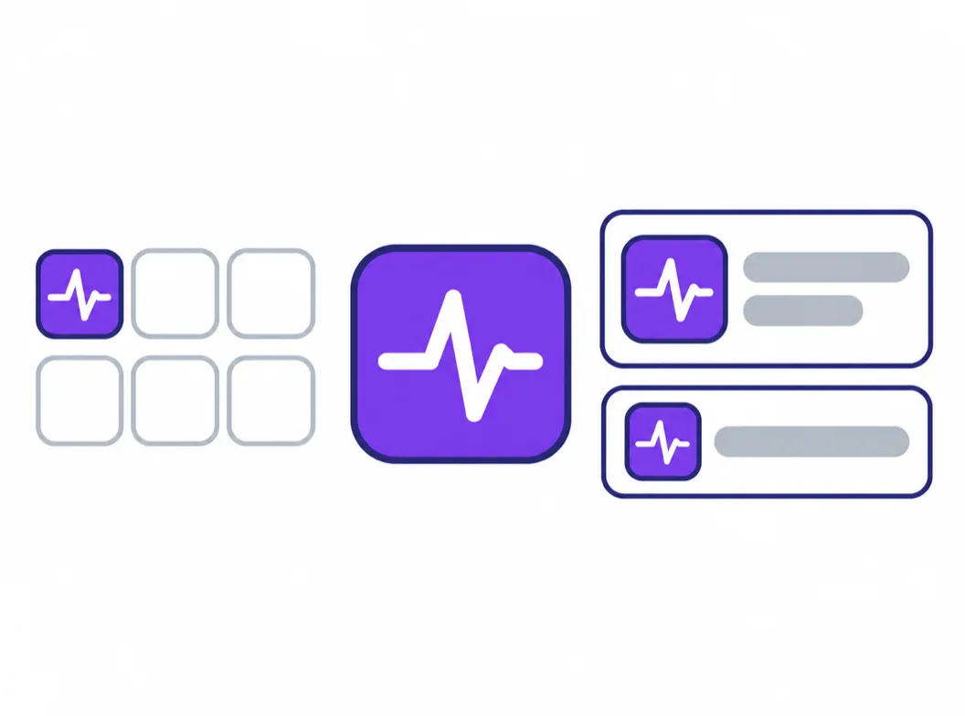
The 48 px preview decides, because that is where users meet the icon every day.
Store cuts from the master
The 1024 px App Store upload and the 512 px Play asset grow from the same file.
Kept for the next release
The canvas holds the mark with its prompt, so the next version starts from history instead of zero.
What the Generator Handles for You
Everything between the one-line brief and the assets both stores accept.
Masters in your palette
Name the colors in the prompt, plain words or hex values, and the candidates arrive in them, with the strong figure-ground contrast a home screen demands.
Branches on one concept
Take the same subject through palette, weight and style variants, compare them side by side, and keep the winner without losing the runners-up.
Small-size previews
Check every candidate at 48, 32 and 16 px, the sizes where home screens, settings and notifications end up rendering it.
Store-ready exports
PNG, ICO and WEBP from one 1024 px master, including the opaque 1024 for the App Store and the 512 px cut for Google Play.
Reference-image matching
Attach an approved mark or a style sample and new generations follow its look, useful when the icon must match an existing brand.
A canvas that keeps the session
Every generation stays on the canvas with its prompt, so the icon can be revisited when v1.1 ships with a new accent color.
Related Workflows
Platform-specific pages and neighboring tools for the same job.
3D app icons
Clay, glass and metallic takes on the same concept.
PNG exports for every surface
Transparency rules and size cuts for web and product.
Desktop icons for macOS
The same mark adapted to the Mac dock and app set.
Resize a finished icon
Cut an existing 1024 px icon into every store size, free and local.
Related Tools
Blog
Further Reading
Longer reads on icons, styles and export workflows.
Mobile App Icon FAQ
What the icon is called, how to get one, and the platform rules that decide whether it ships.
What is the icon for a mobile app called?
It depends on the platform. Apple calls it the app icon; Android calls it the launcher icon on the home screen and an adaptive icon in its two-layer format; the stores also ask for a listing icon, which is a separate upload from the on-device one. One square master serves all of them: the App Store derives its sizes from the 1024 px upload, Google Play takes a 512 px cut, and launchers mask the rest.
How do I get an icon for my mobile app?
Three routes: license a ready-made icon from a pack library, resize an image you already own, or generate one from a brief. Only the third gives you a mark no other app holds. Write one sentence naming the subject, the style and the palette, generate candidates at 1024 px, judge them at 48 px, then export the store cuts from the winner. The generator above starts with free credits.
What size does an icon for a mobile app need to be?
The working master is 1024x1024 px. The App Store takes that single opaque PNG and Xcode derives every smaller size from it; Google Play wants its own 512x512 PNG under 1 MB; Android adaptive layers are 108x108 dp with the logo inside the inner 66 dp safe zone. The full table lives in the mobile application icon size guide.
Should I round the corners of my app icon?
No, on either platform. iOS applies its own superellipse mask on every surface, and if you bake rounded corners into the file the system crops them again and the artwork visibly shrinks. Google Play likewise rejects pre-rounded artwork and applies its own corner treatment in listings. Ship full-square, edge-to-edge artwork and let each surface do its own masking.
How do I make an icon for a mobile app for free?
The generator above starts with free credits: describe the subject, style and palette in one sentence, generate the first candidates, and check them at 48 px before paying anything. Further generations use credits, and every plan includes all styles and export formats. If you only need to resize an icon you already have, the free app icon resizer runs entirely in your browser.
What makes a good icon for a mobile app?
One subject with a silhouette that resolves in one glance, contrast strong enough to survive busy wallpapers and dark mode, no text and no hairline detail, and a centered composition that survives circular crops. Then the check most teams skip: search your category in the store and make sure the mark does not read as a cousin of the top results.
Can I use an icon pack for my app?
You can, within the pack's license, and it is worth knowing what that buys: a file other apps can license too, drawn in a palette that was never briefed for your product. Category pages full of near-identical stock icons are what that route produces at scale. A generated mark costs about the same and belongs to your app alone.
Why was my app icon rejected by the store?
The recurring reasons: an alpha channel or transparency in the App Store upload, baked-in rounded corners or extra padding, a Google Play PNG over 1 MB or not 32-bit sRGB, and artwork that reads as text at small sizes. Generate the master as an opaque full square and export each store's cut from it, and most of these rejections never happen.
Do I need a different icon for iOS and Android?
The artwork can be the same; the required files differ. Apple wants one opaque 1024x1024 PNG without an alpha channel, Google Play wants a 512x512 PNG, and Android devices render the adaptive two-layer format from your foreground and background. Grow all of them from one 1024 px master so the brand matches on every home screen.
Can I use an AI-generated icon in a commercial app?
Yes. You keep full commercial rights to every icon you generate, subject to the terms of service, including icons shipped in App Store and Google Play products and used in paid campaigns.
Make the Icon for Your Mobile App
One sentence in, a store-ready icon for a mobile app out, with the small-size checks both platforms ask for.