
Logo Design Icon: Custom Logo Icons from One Prompt
Stock vector sites sell the same logo design icon to everyone who clicks download, and most of their licenses were never meant for marks that identify a brand. Describe yours instead: one sentence about the shape, the letter and the palette becomes a 1024 px logo icon you can test at 16 px, export in every format, and own outright.
Logo Icons Generated from Text
Finished marks from the generator, from monogram logo icons to abstract arcs and badge shapes, each existing once because it was generated for one brief.


What Is a Logo Design Icon?
A logo design icon is the symbol half of a logo: the mark that keeps working when the wordmark is too small to read. It lives in harder places than most icons, on a favicon at 16 px, embossed on a product, reversed out of a dark footer, so the good ones are built around one bold silhouette instead of many details. That is also why stock vectors fail at this job. A marketplace file is drawn to look good in the search grid, licensed non-exclusively to every buyer, and outside what most standard licenses permit for identifying a brand. Generating from your own brief inverts all three: the shape answers your name, the mark exists once, and the rights are yours.
One silhouette carries the whole mark
A letterform, an abstract arc, a shield: the strongest logo icons commit to a single readable shape, then let spacing and color do the rest. Detail that only reads at full size is detail a favicon will delete.
The master ships everywhere
Generate at 1024x1024 and cut down: favicon, app tile, avatar, print. One master keeps proportions consistent in a way that resizing a small download never does.
Candidates stay comparable
Every generation lands on the canvas with its prompt attached, so three directions can sit side by side, survive a week of team comments, and still be reopened exactly as they were.
Logo Icon, App Icon, Wordmark: Which One Are You Making
The three get conflated in every brief meeting, and each fails differently when asked to do another's job.
The logo icon
The identifying symbol. It must survive single color, reversed on dark, 16 px favicon and a business card at the same time. Test it in all four states before committing, because a mark that only works in full color on white is a poster, not a logo icon.
The app icon
A store presence, built to fill a rounded square on a home screen. It can carry more color and depth than a logo icon because it renders at a floor of roughly 40 px inside a fixed frame, never as a watermark or a fax header.
The wordmark
The name set in type. It pairs with the logo icon rather than replacing it: the icon carries the mark where space is tiny, the wordmark carries it where reading matters. The two are drawn to sit in a lockup, aligned heights, shared spacing.
How to Create a Logo Design Icon in 3 Steps
From a one-sentence brief to a mark that survives the favicon, the avatar and the print run.
- 1
Brief the shape, the letter, the palette
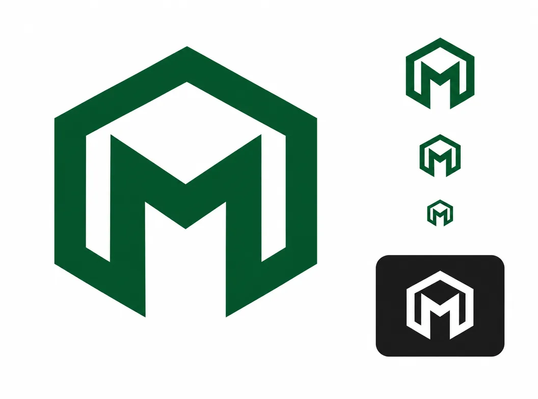
One sentence names all three: "geometric monogram logo icon, letter M inside a hexagon, deep green on white, single ink color, crisp at 16 px, no text besides the letter". Marks briefed this specifically tend to land usable candidates on the first round.
- 2
Test the survivors where logos live
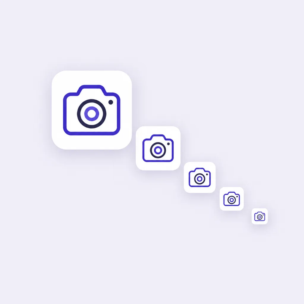
Candidates arrive at 1024x1024. Preview them at 48, 32 and 16 px, and check one reversed on dark, because a logo design icon is chosen at its smallest and its most hostile, not at the size that flatters it.
- 3
Lock the direction, cut every size
Branch the finalist into weight and color variants if the brand needs options, keep the prompt as the recipe, then export PNG, ICO and WEBP cuts from the single master for web, product and print.
Three Routes to a Logo Design Icon
A stock vector, a commissioned designer and an AI generator all hand you a file. They differ most at the two questions that matter for a logo: who else can use the mark, and what happens when you need the next size, the reversed version, or a variation.
| Stock vector marketplaces | Branding agency or freelancer | AI icon generator | |
|---|---|---|---|
| Where the mark comes from | Marketplaces listing thousands of vector logo shapes sold to every buyer | A discovery and design process, briefed on your brand and audience | Your prompt: shape, letterform and palette in one sentence |
| Who else can use it | Every other licensee of the same file; most standard stock licenses exclude trademark and exclusive brand use | No one, when the contract assigns the rights to the final artwork | No one: each generation is a new drawing that exists once, with commercial rights under the terms of service |
| Fit to the brand | Whatever the grid happens to list; recoloring a vector is yours to do | The whole point of the route, reflected in the timeline and the price | Generated in the exact palette, letter and style family the prompt names |
| Turnaround | Immediate download | Weeks, including discovery, presentation and revision rounds | About a minute per generation round, variants included |
| Getting variations later | Search again, or edit the vector yourself | A new scope, usually at new cost | Re-run the prompt, or branch the chosen mark on the canvas |
| Cost | Subscription or per-file, the cheapest until exclusivity matters | The most expensive route, priced for a full identity, not one mark | Credits per generation, free credits to start |
Comparison of typical routes for a logo design icon, based on marketplace license terms and common agency and freelance pricing as of 2026.
What the Generator Handles for You
Everything between the first sentence of the brief and a master file that covers every surface a logo touches.
Marks in your palette
Name the colors in the prompt, plain words or hex values, and the candidates arrive in them, ready for the brand without a recoloring pass.
Reference-image matching
Upload a mark you already approve of and new generations follow its look, which keeps explorations inside a visual direction instead of scattering across styles.
Variants for the shortlist
Branch one concept into weight, palette and layout versions, compare them side by side, and keep the finalists without losing the runners-up.
Favicon-scale previews
Check every candidate at 48, 32 and 16 px, the sizes where a logo design icon either holds its silhouette or stops being usable.
Exports for every surface
PNG, ICO and WEBP from one master, transparent backgrounds for lockups and solid cuts for avatars and app tiles.
A canvas that keeps the shortlist alive
Generations stay on the canvas with their prompts, so the exploration that sold the team can be reopened when the brand extends.
Letter and Monogram Logo Icon Prompts
Copy any of these into the generator, then swap the letter and palette for your own. A strong logo design icon prompt names three things: the shape strategy, the letterform, and the palette with its background, because those three decide whether the mark can anchor an identity.
Geometric monogram
geometric monogram logo icon, letter M inside a hexagon, deep green on white, single ink color, crisp at 16 px, no text besides the letter
Abstract arc mark
abstract logo design icon, two interlocking arcs forming a loop, single ink navy on white, bold silhouette, centered, no text
Badge mark
badge style logo icon, mountain peak inside a shield outline, navy and sand on cream, thick even stroke, readable at 24 px, no text
Related Workflows
One generator behind every icon the brand ships, from the identifying mark to the browser tab.
A matched family for the brand
Extend the logo icon's palette and weight across the app, site and deck.
The full icon design workflow
Concept, silhouette and small-size testing for marks that must survive every surface.
Custom icons from one prompt
Concept marks for designers and creators, briefed and generated in your system.
Site icons and favicons
favicon.ico, apple-touch-icon and PWA sizes cut from the same master.
iOS app icons
The store-facing square, sized and exported for the Apple grid.
Resize a finished square
Cut an existing 1024 px icon into every store and web size, free and local.
Related Tools
Blog
Further Reading
Longer reads on icons, styles and export workflows.
Logo Design Icon FAQ
What a logo design icon covers, why stock vectors and logos sit awkwardly together, and the questions asked before generating.
What is a logo design icon?
It is the symbol half of a logo: the mark that identifies the brand when the wordmark is absent or too small to read, on a favicon, an avatar, a product or a sign. A good one is built around a single readable silhouette, works in one color and reversed on dark, and stays recognizable at 16 px.
Can I use a stock vector as my logo?
Most designers advise against it, and the licenses back them up. Stock licenses are non-exclusive, so other buyers can license the same vector, and most standard licenses exclude trademark and exclusive brand-identifying use. A logo is the one place a mark needs to belong to you alone, which is why logos are drawn, commissioned or generated, not downloaded.
How do I create a logo design icon with AI for free?
The generator above starts with free credits. Name the shape strategy, the letterform and the palette in one sentence, generate the first candidates, and test them at 16 px and reversed on dark before paying anything. Further generations use credits, and every plan includes all styles and export formats.
What makes a good logo icon?
One silhouette that reads at 16 px, a shape that works in single color, enough distinction that it does not dissolve into the generic marks of its category, and a form that sits comfortably beside the wordmark in a lockup. Test all four before committing, because logo icons usually fail at the small end first.
What is the difference between a logo icon and an app icon?
Scope of duty. A logo design icon identifies the brand everywhere, watermarks, favicons, print, so it leans on one silhouette and single-color robustness. An app icon fills a rounded square on a home screen at a floor of roughly 40 px, so it can carry more color and depth. Many brands derive the app icon from the logo mark, simplifying as needed.
How do I test a logo icon before committing?
Run four checks on the finalist: render it at 16 px, print it in one color, reverse it white on dark, and set it beside the wordmark at aligned heights. A mark that passes all four will handle the surfaces you have not thought of yet; one that fails the favicon will fail it in public.
How do I match a logo icon to my brand palette?
Name the colors in the prompt itself, hex values or plain color words, and the candidates arrive in them. For variations, branch the chosen mark into palette versions instead of recoloring a raster later, which breaks anti-aliased edges and never quite matches the brand reference.
Can I trademark an AI-generated logo icon?
Trademark rules differ by jurisdiction and are still evolving for AI-generated work. You hold commercial rights to the icons you generate under the terms of service, and a trademark attorney can tell you what registration requires in your market; using a mark that exists only for your brand is the usual starting point either way.
Can I use AI-generated logo icons in commercial projects?
Yes. You keep full commercial rights to every icon you generate, subject to the terms of service, including marks used in client work, shipped products and paid campaigns.
What file formats does a logo icon need?
PNG with transparency for web and lockup work, ICO for the favicon, WEBP for lighter delivery. The master is 1024x1024 and every smaller cut comes from it, so the same mark stays sharp from the browser tab to the print run.
Start Your Logo Design Icon
Write the one-sentence brief, generate candidates in your palette, test them at 16 px and reversed on dark, and export every cut the brand needs.