
Google Play App Icon Generator: One Prompt to a Store-Ready Icon
A Google Play icon is really two assets: the 512x512 PNG that Play Console checks against hard specs before your listing goes live, and the adaptive layers that land on the home screen after install. Describe your mark once and this generator produces the store asset plus every launcher size, with formats that pass icon review the first time.
Google Play App Icon Examples
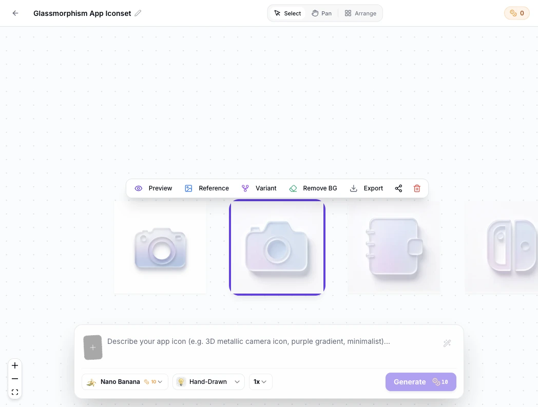
Icons generated for Play Store launches: bold single subjects in flat, 3D and glass styles that stay readable from the 512 px listing asset down to a masked launcher icon.


What Is a Google Play Icon Generator?
A Google Play icon generator is a tool that produces the icon assets an Android release needs for the Play Store: the 512x512 listing PNG that Play Console validates against hard specs, plus the launcher sizes the app wears on the home screen after install. Building both by hand means juggling sRGB rules, the 1024 KB file cap and five mipmap buckets; the generator handles the numbers so the work stays on the mark itself. Describe the icon in one prompt, check it under the store's rounded-square mask, and cut the 48 to 192 px mipmap set from the same 1024 master. The first render is rarely the final one. On the infinite canvas, every Play icon becomes a node you can branch from: tweak the prompt, compare variants side by side, replace the background in one click, and trace every iteration back to its origin before exporting the final store set.
Visual Lineage Tree
Track prompt iterations and remix variants with elegant Bezier curves to compare lighting, texture, and color branches side by side.
Built-in Post-Processing
Instant 1-click background cutout with precise color replacement to fulfill strict store non-transparent requirements.
Safe Zone Protection
Adjustable inner padding guides protect key artwork silhouettes from aggressive launcher corner clipping.
Google Play Icon Prompt Examples
Copy any of these into the generator, then edit the subject, style and color words to fit your app. A strong Play icon prompt states three things: the subject and where it sits in the square, the style and palette, and that the mark must survive launcher masks at small sizes.
Minimal utility mark
Minimal Google Play app icon, single geometric bolt centered on a deep indigo field, thick silhouette readable at 48 dp, full square composition, no text, no baked rounded corners, flat style
3D game icon
3D game app icon for Google Play, glossy treasure chest subject filling two thirds of the square, warm rim light, saturated colors, single clear silhouette that reads small, full square background
Adaptive-friendly letterform
Android app icon for a Play Store release, bold letter K centered inside the safe zone, solid coral background layer, white foreground mark, simple shapes, no thin strokes that break at small sizes
How to Make a Google Play Icon in 3 Steps
From one sentence to the full store set, with no image editor open.
- 1
Describe the icon
Write one sentence covering subject, style and colors, like "a flat compass mark, navy on white, Google Play icon for a hiking app". One clear shape gives the launcher mask something to preserve.
- 2
Generate the 1024 master, then check it masked
Generate at 1024x1024 and preview the icon under the rounded-square store mask and at 48 dp before judging it. The listing asset is a full square, but users meet it masked and small.
- 3
Export the store set
Export the 512x512 Play asset and the launcher mipmap PNGs from the same master. Each file meets the format rules in the table below.
Google Play Icon Size and Format Specs
Play Console validates the listing icon against hard numbers before review, so the numbers come first. These are the current requirements.
| Asset | What you submit | Format rules | What happens next |
|---|---|---|---|
| Play Store listing icon | One 512x512 px PNG | 32-bit PNG in sRGB, at most 1024 KB, full square artwork with no baked rounded corners; opaque fills render most predictably in the store | The listing header and search results show it masked to the store's own rounded square |
| Android adaptive icon, on device | Foreground, background and monochrome layers, 108x108 dp each | Logo inside the inner 66 dp safe zone; the outer 18 dp per side is bleed for launcher masks and parallax | Each launcher masks the layers to its own shape; on Android 13 and up the monochrome layer feeds themed icons |
| Launcher mipmap set | 48, 72, 96, 144 and 192 px PNGs | One PNG per density bucket from mdpi to xxxhdpi, plus the legacy 48 dp icon | Installers pick the closest bucket, so the mark must still read at 48 px |
| Play search and shelves | Reuses the 512x512 listing asset | Served at reduced sizes in search results, similar-app shelves and install prompts | Small render sizes make a bold single subject the deciding factor |
Specs follow Google Play Console requirements and Android adaptive icon documentation, checked September 2026.
Describe the mark, preview it under the store mask, then ship the 512x512 asset and the mipmap set from the table above in one pass.
Open the Google Play Icon GeneratorOne master, every Play surface
Every surface in the table reads a different file cut from the same 1024px master. Have a finished square logo already? The free app icon resizer slices it into the 512 asset and every mipmap size.
The 512 listing asset
The only file Play Console asks you to upload as the app icon. It must be a full square 32-bit PNG in sRGB under 1024 KB. The store rounds the corners itself, so artwork with baked-in rounding gets cropped twice.
The adaptive icon on the device
After install, the home screen shows the adaptive icon, not the 512 asset. Foreground and background layers of 108x108 dp survive masks from circles to squircles, and the monochrome layer keeps themed icons working on Android 13 and up.
The mipmap density set
Launcher icons ship as 48 to 192 px PNGs across density buckets. The generator cuts each one from the same master, so the silhouette stays consistent at every size.
Listing neighbors
The icon sits beside the 1024x500 feature graphic in the listing. A bold icon with a quiet graphic reads better than two busy images competing in the same row.
Where the Play Store icon actually appears
The listing header is the obvious spot, but the same square travels: search results beside competitor icons, the similar-apps shelf, the install confirmation sheet, the home screen after install and the app drawer. Design for the smallest of these first, because a mark that reads in a crowded search row holds up everywhere else.
Three Ways to Get a Google Play Icon
An AI generator, an icon template library and a freelance designer all produce a Play icon. They differ in speed, cost and how much of the result is yours.
| AI icon generator | Icon template library | Hiring a designer | |
|---|---|---|---|
| Uniqueness | Every icon generated for your prompt | Shared with everyone who bought the pack | Original, within the brief |
| Time to a finished icon | Under a minute per concept | Minutes of browsing | Days per round |
| Cost | Credits or subscription, free to start | Cheap to free | Hundreds per project |
| Store spec compliance | 512 asset and mipmap set exported to spec | Manual resizing left to you | Handled if the brief includes exports |
| Style control | Full, by prompt and preset | Fixed packs | Full, with skill |
| Copyright and store risk | Yours to use in shipping apps | License terms to check, lookalike risk in search rows | Contract terms to check |
Comparison of typical workflows, verified as of 2026.
What the Generator Handles for You
Everything between the first prompt and files Play Console accepts.
One 1024px master
Generate once at full resolution; the 512 asset and every mipmap size downscale from it cleanly.
Store-ready 512 export
The 512x512 PNG leaves the generator square and inside the 1 MB limit, ready for Play Console.
Full mipmap set
48, 72, 96, 144 and 192 px launcher PNGs cut from the same master, no manual resizing.
Mask preview, not baked corners
Preview how the store and launchers will round the artwork while the file stays a full square.
Variants until it reads small
Regenerate the same concept to test weights and colors until the mark survives crowded search rows.
Every style for one mark
Flat, 3D, glassy, pixel and more presets, tuned for launcher-scale marks.
Play Icon Styles, from Flat to 3D
Style decides whether the mark survives the shrink from a 512 px listing asset to a masked 48 px launcher icon. Flat and minimalist marks hold small sizes most reliably, 3D and glassy presets add depth once the silhouette stays single and bold, and pixel styles turn the constraint into the look itself. Compare directions at icon scale in the icon style gallery: the 3D, glassy and minimalist pages show each style on real marks.
Design a Play Icon That Survives Search Results
Most Play icon problems come from designing for the listing header alone. Four habits prevent them. Compose the full square, because the store and launchers mask everything and forgive nothing. Keep strokes thick, since hairlines vanish at launcher size. Hold contrast against both light and dark shelves, the store renders your icon on surfaces you do not control. And preview masked before committing: the rounded-square crop is how most users first meet the icon.
Where the Workflow Fits
One master from the generator, exported for every surface that shows a small square beside your app's name.
First Play launch
Ship the 512 asset with the listing, export the adaptive set for the build, and pass icon review once.
Listing refreshes
New icon, same app: regenerate, export and update the listing the same afternoon.
Multi-app families
Reuse one prompt base to keep a family of apps consistent across a developer page, then browse the icon gallery when the set needs to grow.
Web apps shipped to Play
The same master feeds the web manifest icons and the Play listing, one silhouette everywhere.
Shipping to both stores
iOS, Android and PWA icon rules in one table for teams releasing everywhere.
Listing experiments
Generate two icon directions, run a store listing experiment in Play Console, and let real install data pick the winner.
Blog
Further Reading
Longer reads on icon design, store specs and workflows.


Google Play Icon FAQ
Sizes, formats, rejections and the questions people actually ask about Play Store icons.
What size is a Google Play icon?
The Play Store listing icon is 512x512 px: a 32-bit PNG in sRGB, under 1024 KB, as a full square. The icon on the device home screen is separate: adaptive layers of 108x108 dp with the logo inside the inner 66 dp safe zone.
What format does Google Play require for the app icon?
A 32-bit PNG in the sRGB color space, 512x512 px, at most 1024 KB, with no baked-in rounded corners. Upload the full square artwork; the store applies its own corner treatment.
Does Google Play round the corners of my icon?
Yes. The store masks the 512 asset to its rounded square in listings and search results, and launchers mask the adaptive icon again on device. Upload full-square artwork and let every surface do its own rounding; pre-rounded icons get visibly cropped twice.
Is the Play Store icon the same as the app icon on my phone?
No. The 512x512 listing asset represents the app in the store. The home screen icon after install comes from the adaptive icon layers packaged inside the APK or AAB. Grow both from one master so the brand matches everywhere.
Why was my Play Store icon rejected?
The three usual reasons: the file is over 1024 KB, the PNG is not 32-bit sRGB, or the artwork carries baked-in rounded corners or padding. Export a full square from the master and re-upload it in Play Console.
Can my Google Play icon have a transparent background?
The upload field accepts 32-bit PNG, but transparent regions render as black in most store surfaces, so an opaque full square is the safe choice. On the device, the adaptive format uses a background layer instead of transparency.
How do I make a Google Play icon?
Describe the subject, style and platform in one sentence, generate the 1024 master in the Google Play icon generator above, preview it under the store mask, then export the 512 asset and the launcher set from the same file.
Can I use the generated icon in a published app?
Yes. You keep full commercial rights to every icon you generate, subject to the terms of service, including icons shipped on Google Play.
Do I need a different icon for the App Store?
Apple asks for a 1024x1024 opaque master without an alpha channel, and Xcode derives every smaller size from it. The mobile application icon guide covers both stores side by side.
Ship a Google Play Icon That Passes Review
Describe the mark once, export the 512x512 asset and every launcher size from one master, and update the listing the same day.