
Best App Icons: 10 Examples and Why They Work
What earns an app icon the word "best"
People search for the best app icons for two reasons: they want inspiration before designing their own, or they want a standard to judge a design against. Both need the same thing from a list, not fifty screenshots, but an explanation of why each mark works and what to steal from it. So before the gallery, here is the filter this article applies.
Every gallery of the best app icons is really a test of three things. First, recognition: you should name the app from the icon alone, at a glance, with no label attached. Second, survival: the mark still reads at 1024 px in a store listing and at 48 px in a settings list, without redrawing. Third, separation: the icon looks like nothing else installed on the phone, so the eye lands on it in a grid of forty neighbors.
Those three tests filter more than taste does. Plenty of pretty icons fail one of them, and plenty of plain icons pass all three because the designer spent the effort on silhouette and contrast instead of ornament. The ten icons below pass all three, year after year, which is why they keep showing up in every "best app icons" list ever since.
The 2026 backdrop: Liquid Glass and expressive color
Two platform shifts changed what a "good" icon means this decade. At WWDC in June 2025, Apple introduced Liquid Glass, a translucent layered design language that spans iOS 26, iPadOS 26 and macOS Tahoe 26. App icons gained system-rendered light, dark, monochrome and tinted modes, and developers received Icon Composer, a tool that separates an icon into layers so the system can apply the glass treatment. Google moved the same direction with color: in May 2025 it refreshed the four-color "G" across its apps toward a shared gradient family, and Material 3 continues to push expressive shapes and adaptive theming on Android.
The practical consequence for anyone designing an icon now: your master needs a strong foreground layer and a background that survives being tinted, darkened or squashed behind glass. Instagram is the latest case study, having announced its first major brand refresh in over ten years in August 2026 while keeping its abstract camera icon essentially intact, which tells you how much equity a settled icon carries. For the platform rules themselves, Apple's Human Interface Guidelines on app icons and Google's adaptive icon documentation are the two primary sources worth reading in full.
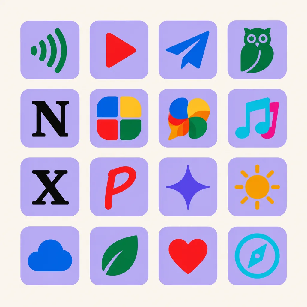
10 of the best app icons, and why each one works
Spotify
A green field with three black arcs bent like sound waves. Nothing else. It works because one concept (audio) is drawn with one shape family (arcs), on a green no other major app owns. At 48 px you still read it as music. The lesson: a single geometric motif, repeated three times, beats a detailed illustration of anything.
YouTube
A red rounded rectangle with a white play triangle. The shape is older than the company, and that is the point: a universally understood symbol means the icon explains the product with zero learning. Note the proportions. The red field is the brand, the triangle is the function, and neither competes with the other at small sizes.
Telegram
A white paper plane on a blue circle. The plane reads as "send", the circle frames it cleanly in every crop and mask Android and iOS apply. As icons got flatter over the years, this one barely changed, because a solid shape with one fold line was already as simple as an icon gets. It is also the clearest example of a background shape doing real work: the circle guarantees the mark stays composed even when a launcher crops it into a squircle.
Duolingo
The green owl, drawn large, filling the frame. Almost no other app icon commits this hard to a character, and the risk pays off because the owl is the product's mascot and tutor. The details hold up because the drawing keeps two huge shapes, the head and the eyes, and lets everything else stay secondary. This is the strongest argument that "best" does not require geometry: a character works when it carries real brand equity and stays bold at small sizes.
Notion
A near-black field with a serif "N". In a store full of gradients, the absence of color is the differentiator. It also proves a letter mark can survive the small-size tests when the letter is thick, centered and given room to breathe. Pair it with the X icon and you have both ends of the letterform spectrum: expressive drawn script on one side, austere geometric strokes on the other.
Figma
Four colored shapes stacked into one taller shape. The icon demonstrates the product's own idea, objects combining into a design, and the four-color system (red, orange, green, blue) is distinctive without a gradient in sight. Geometric, flat, and impossible to confuse with another tool.
Slack
Four rounded chat bubbles in four colors, rotated into a pinwheel. After the 2023 simplification, the icon got flatter and the shapes got rounder, and recognition improved, a useful reminder that simplifying an established icon usually wins more than it risks.
TikTok
A black field, a white note, and cyan and magenta offset ghosts of the same note. The offset print effect creates depth without any soft shading, and it looks native to the screen culture the app comes from. Of the ten icons here, it is the best example of using color separation instead of texture.
X
Black field, white letterform. When Twitter became X in 2023, the icon went from a bird with a decade of equity to a raw constructivist letter. Controversial at launch, but structurally sound: heavy strokes, perfect symmetry, legible at 16 px. It shows that a severe mark can still pass all three recognition tests when the strokes are thick enough.
A red field with a white script "P". The letter is drawn, not typed, and the loop of the P echoes a pin. Combining letterform and object in one gesture is the hardest trick on this list, and Pinterest is one of the few that lands it cleanly at favicon size.
What the best app icons have in common
Strip away the brands and five patterns remain.
- One concept per icon. Music, send, play, search. The icons above never draw two ideas, because a mark that means two things reads as neither at 48 px.
- A silhouette you can fill in. Squint until the colors vanish. The Spotify arcs, the YouTube triangle and the Telegram plane survive as pure shape, and pure shape is what peripheral vision recognizes first.
- An owned color. Spotify green, Duolingo green, Telegram blue, Pinterest red. One dominant, unusual color does more brand work than a six-stop gradient, because color is the first thing the eye matches in a grid.
- Real margins. Every mark keeps distance from the icon edges because platforms crop corners, round squares and apply masks differently. Tight compositions die in adaptive icons and watch faces.
- Stability over fashion. Most of these icons have moved a few pixels in a decade, no more. The icon is a recognition asset; reinventing it spends equity and buys a week of attention.
Best app icon design moves worth borrowing
The shared patterns tell you what the ten icons have in common. These five moves are what to do about it in your own best app icon design work.
- Borrow the offset-print trick for depth. TikTok gets depth from one white shape and two colored echoes of it, with no gradients or shadows. Two offset copies of your silhouette in your accent colors read as depth on every screen and every DPI.
- Pick one owned color before drawing anything. Decide the color the way Spotify decided green: check the competitors' icons, then claim the gap. The palette decision shapes every later one, so make it first, not last.
- Design the silhouette in black and white first. If the shape does not work as a flat monochrome mark, color will not rescue it. This is also preparation for iOS 26's monochrome and tinted icon modes, which strip your color for you.
- Commit to one corner language. Match your icon's curves to your in-app interface the way Figma's rounded shapes match its friendly tooling. Mixed corner radii read as carelessness long before anyone can name the problem.
- Plan the whole size ladder, not just the icon. The store master, the 48 px settings cut and the 16 px favicon are one family. Design the master, then verify every smaller size as a reduction of it, the way the Telegram circle reduces to a dot with wings that still reads.
How to design an app icon that belongs on lists like this
The craft in those ten icons is reproducible without a brand budget, and the workflow is short. Write the concept as a prompt that names the single idea, the style family and the background, the same three decisions the icons above made. Generate candidates at 1024x1024, then judge them at 48, 32 and 16 px before settling on any of them, because the small previews are where crowded marks collapse. Branch the winner into a second weight or palette rather than starting over, then export the cuts each platform wants.
SparkIconAI runs exactly this loop: describe the mark on the icon design page, keep reference images pinned so variants stay inside your approved look, and export PNG, ICO and WEBP sets from one master. If you already have a finished square, the free app icon resizer cuts it into every store and web size without a new render. New to the vocabulary of icons in general? Start with what an app icon is, then come back and write your first prompt on the AI icon generator.
FAQ
What makes an app icon the best?
Recognition without a label, legibility at small sizes, and separation from neighboring icons. The ten examples above pass all three, and the patterns they share, one concept, a strong silhouette, an owned color, generous margins, are the working definition of best app icon design.
Which app icons are considered the best?
Spotify, YouTube, Telegram, Duolingo, Notion, Figma, Slack, TikTok, X and Pinterest appear in most curated lists, including this one, because each owns a color or a shape and has kept it stable for years.
How many icons should I design before choosing?
Generate at least three takes per concept before judging. The first candidate is rarely the strongest, and comparison is how you notice a weak silhouette. Keep every take on the canvas so an early direction can return later.
Do I need different icons for iOS and Android?
You need one master with enough margin to survive both platforms' treatments. iOS applies its own corner rounding and, since iOS 26, optional glass layers; Android masks your icon into shapes and themes it. Design the 1024 px master with generous margins, then export per-platform cuts.