
Graphic Icon Design with AI: Custom Graphic Icons from One Prompt
Most icons in design projects are borrowed from stock libraries, so the palette, stroke weight and corner style never quite match the rest of the page. Describe the mark instead: this generator turns one sentence into a 1024 px graphic icon in your own palette, with versions to compare, small-size checks, and every export format a graphic design project needs.
Graphic Icon Examples
Marks generated from single prompts: flat, line, geometric and 3D graphic icons that keep a clean silhouette from the 1024 px master down to a 16 px favicon.


What Is Graphic Icon Design?
Graphic icon design is the craft behind the small symbols a project leans on everywhere. It is not a logo: a logo is one brand's single identifying mark, while graphic icons are a family of small marks sharing one system. Describe a concept, generate candidates at 1024 px, and let the small-size preview settle the argument.
One system, many marks
Graphic icons earn their place by belonging to a family: same stroke weight, same corner language, same palette. A beautiful icon that breaks the system reads as noise on the page.
Weight follows type
A hairline icon beside a bold headline looks broken. Candidates are generated in the weight your typography uses, so the mark and the type feel drawn by one hand.
Every take stays on the canvas
Each generation lands as a node with its prompt attached, so you can branch a direction, compare takes, and reopen last week's session without redoing work.
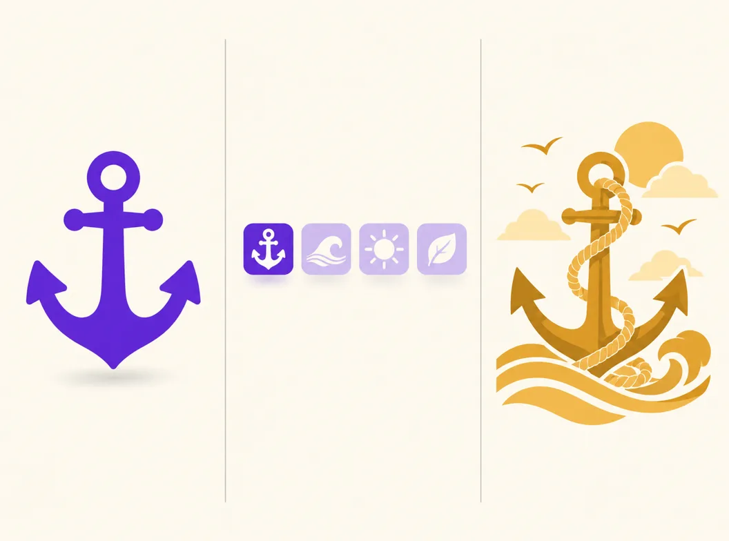
Three Ways to Get Graphic Icons
A stock library, an AI generator and a commissioned designer all end at a folder of files. They differ in whether the mark matches your project, what the license allows, and what it costs to add the next icon to the set.
| Stock icon libraries | AI icon generator | Commissioned designer | |
|---|---|---|---|
| Starting point | Search terms, then filtering | A sentence naming the concept, style and palette | A brief and a kickoff call |
| Fit with your project | Closest match wins; palette and stroke weight rarely line up | The prompt carries your palette, weight and corner style into every mark | Drawn to match, after a few rounds of feedback |
| License | Varies by library and plan, attribution sometimes required | Commercial rights to every icon you generate | Defined by contract, often with usage limits |
| Adding the next icon | Search again and hope a lookalike exists in the same set | Reuse the style and a reference image, and the family stays consistent | Back in the queue, billed per mark |
| Time per mark | Minutes of searching, then manual resizing | Under a minute per concept | Days to weeks per set |
| Cost at set scale | Subscription or per-icon packs, repeated yearly | Credits per generation, free credits to start | The highest option, priced per set or per day |
Comparison of typical icon sourcing workflows for design projects, checked against library pricing and commission norms as of 2026.
Graphic Icon Prompt Examples
Copy any of these into the generator, then swap the subject for your own. A strong prompt for a graphic icon names three things: the concept, the style family, and the palette with its background, because those three decide how the mark sits in a layout.
Flat brand mark
flat graphic icon, bold anchor, two solid colors on an off-white background, generous margins, readable at 16 px, no text
Geometric line mark
outline graphic icon, geometric wave, uniform 2 px stroke, indigo on white, open negative space, crisp at 24 px, no text
Editorial sticker mark
sticker style graphic icon, retro sun with rays, warm palette on cream, thick outer border, poster ready, no text
How to Design a Graphic Icon in 3 Steps
From a one-line concept to a master file that covers the deck, the site and the favicon.
- 1
Name the concept and the style
Write one sentence that names the concept, the style family and the palette, like "flat graphic icon, bold anchor, navy on cream, readable at 16 px". The more specific the silhouette, the fewer rounds you need.
- 2
Generate, then judge small
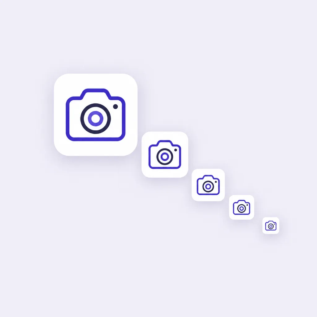
Candidates arrive at 1024x1024. Switch to the 48, 32 and 16 px previews before picking a favorite, because crowded detail and thin strokes only reveal themselves at the sizes the mark will really render.
- 3
Pair with the palette, export everywhere
Set the winner beside your color and type samples, branch it if the weight needs adjusting, then export PNG, ICO and WEBP cuts from one master for print, web and app surfaces.
What the Generator Handles for You
Everything between the first sentence about a concept and a master file that drops into the layout.
Palette-accurate marks
Name your colors in the prompt and the candidates arrive in them, so icons sit in the layout without a recoloring pass.
Reference-image matching
Upload an approved mark and new generations follow its look, which keeps the whole set inside the style you already signed off.
Different takes on one concept
Branch a mark into weight, palette and style versions, compare them side by side, and keep the winner without losing the runners-up.
Small-size checks
Preview every candidate at 48, 32 and 16 px, the sizes where graphic icons fall apart next to their labels.
Exports for every surface
PNG, ICO and WEBP from one master, with transparent backgrounds for layout work and solid cuts for buttons and badges.
A workspace that remembers
Generations stay on the canvas with their prompts, so a set started today can continue next week exactly where it stopped.
Graphic Icon Styles, from Flat to 3D
Style is the loudest decision in graphic icon design: flat families ship the boldest silhouettes for buttons and wayfinding, line families keep interfaces quiet, 3D and sticker families carry personality on posters and covers. Compare directions on finished marks in the icon style gallery: the line, minimalist and 3D pages show each family on real icons.
Rules for Pairing Icons with a Design System
Four rules keep graphic icons inside a design system. Pair stroke weight with type weight, because a hairline icon under a bold headline reads as broken. Generate icons directly in the brand palette plus at most one accent, instead of recoloring stock marks later and breaking their edges. Keep one corner language, all rounded or all square, across every mark in the set. And judge each icon at 16 px next to its actual label, since most design work ships icons smaller than they were designed.
Graphic Icons Across Design Projects
One icon family serves every artifact a project ships, and each surface asks for a different cut of the master. Have a finished square already? The free app icon resizer cuts it into every size without a new render.
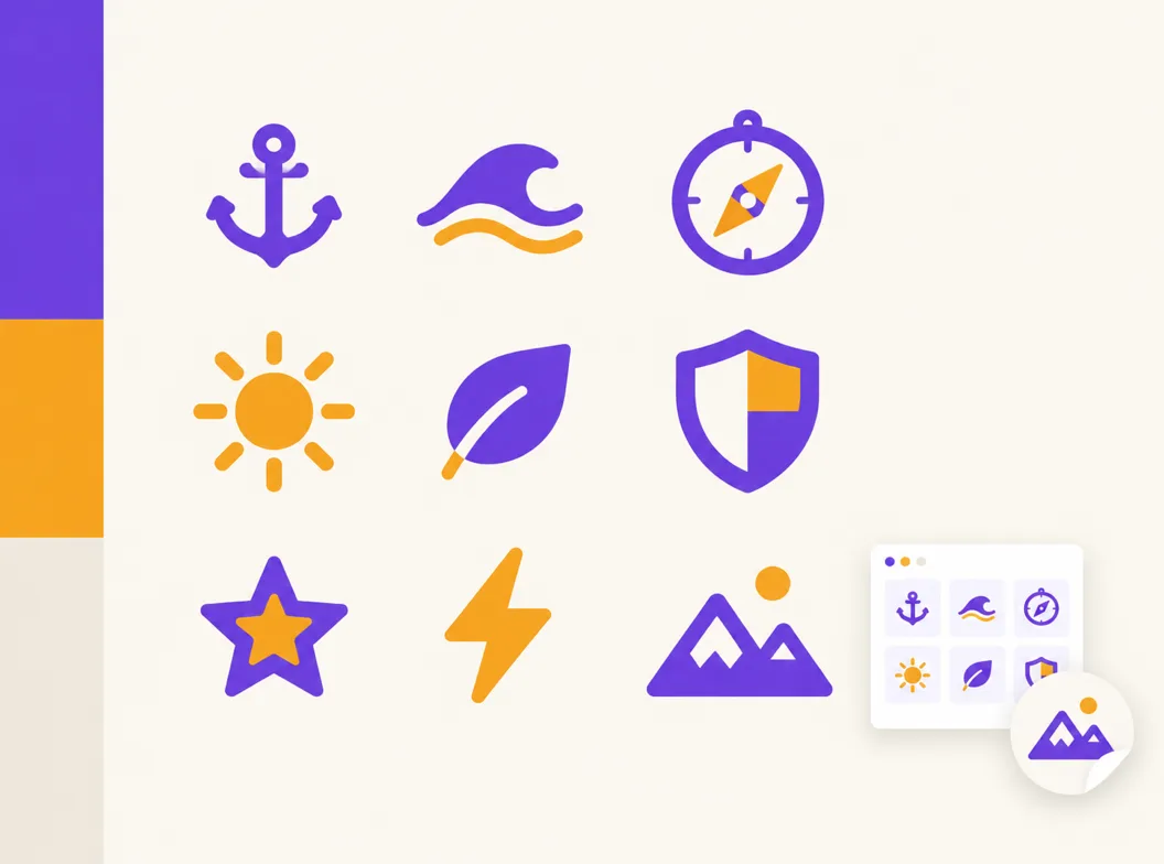
One family, every artifact
Design the strongest version first at 1024 px, then let every smaller cut inherit its silhouette: the same wave reads as a hero mark on the cover and a 16 px favicon in the tab strip.
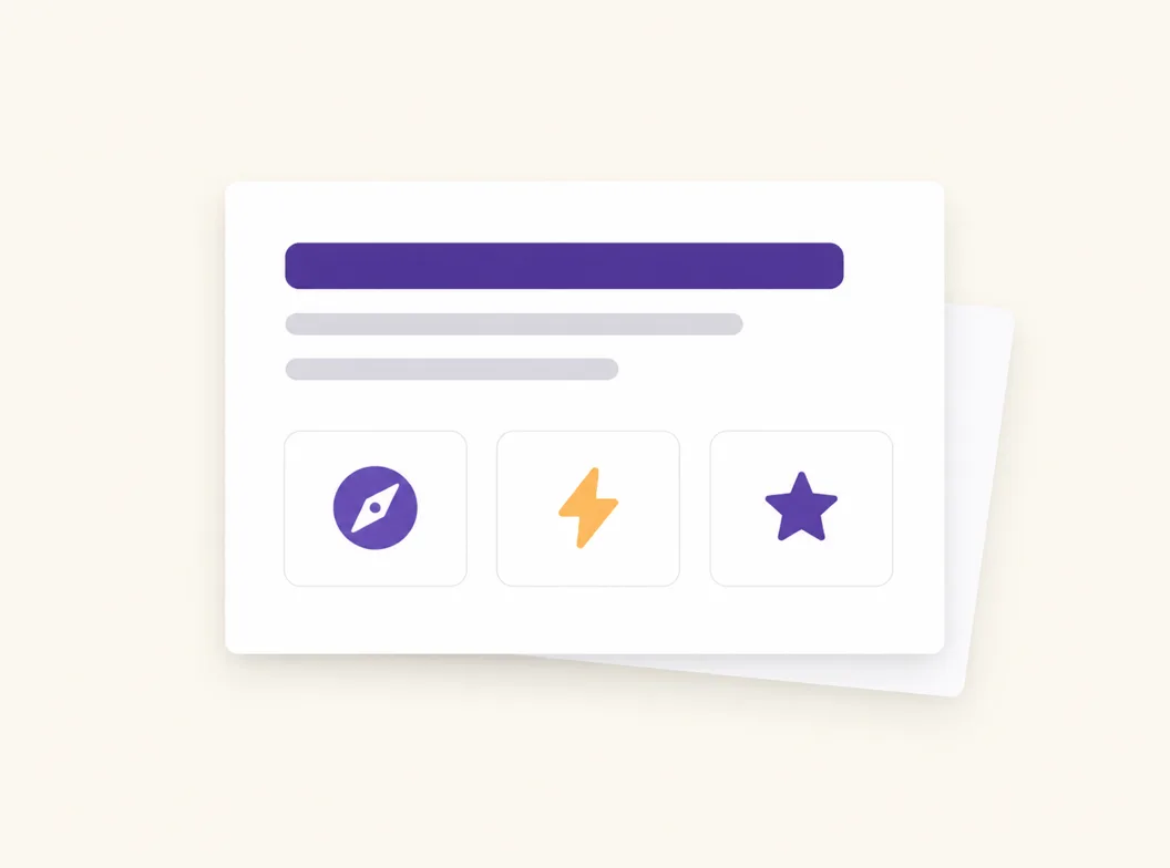
Decks and one-pagers
Feature bullets and section headers want small, consistent marks. Generate the set in one pass and every slide carries the same visual voice.
Websites and product UI
Feature grids, empty states and navigation rows render icons at 16 to 32 px, which is where icon quality is really tested. Transparent PNG and WEBP cuts drop straight into the layout.
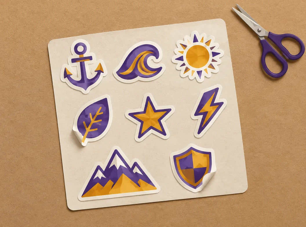
Print, packaging and merch
The 1024 px master holds up at print resolution for stickers, tissue and hang tags. Export a solid-background cut when the mark goes on colored stock.
Related Workflows
One generator behind every icon a project ships, from the store listing to the browser tab.
The full icon design workflow
Concept, silhouette and small-size testing for marks that must survive every surface.
A matched family for the brand
Take the design language across the app, site, deck and support pages.
Feature grids of eight
A consistent set of 8 icons for the landing page, one prompt family.
Favicon and web cuts
favicon.ico, apple-touch-icon and the PWA sizes from the same master.
Browse finished marks
See how concepts, styles and palettes hold up on real icons before writing your prompt.
Resize a finished square
Cut an existing 1024 px icon into every store and web size, free and local.
Related Tools
Blog
Further Reading
Longer reads on icons, styles and export workflows.

Graphic Icon Design FAQ
What graphic icon design covers, how it differs from a logo, and the questions designers ask before generating.
What is graphic icon design?
It is the practice of drawing the small graphic symbols a design project uses throughout its materials: a compass for a studio, a wave for a surf brand, a shield for a security pitch. The work covers choosing one concept per mark, giving it a silhouette that reads in a glance, and keeping the whole family consistent in weight, palette and corner style from the 1024 px master down to a 16 px favicon.
How is a graphic icon different from a logo?
A logo is the single identifying mark of one brand, and it carries the brand name with it. A graphic icon is one of many marks inside a system, each standing for one concept, none of them carrying the name. In practice the logo sits in the header and the icon family sits everywhere else: buttons, feature grids, wayfinding and print.
Where can I get icons for graphic design?
Three routes: stock libraries like Flaticon or The Noun Project, which are fast but generic and license-limited; an AI generator like this one, which produces custom marks in your palette in under a minute; or a commissioned designer for fully bespoke work. The comparison table above breaks down fit, license and cost for each route.
How do I design a graphic icon with AI for free?
The generator above starts with free credits: describe the concept, generate the first candidates, and check them at small sizes before paying anything. Further generations use credits, and every plan includes all styles and export formats.
Do I need to be a graphic designer to use this?
No. The prompt carries the vocabulary: name the concept, the style family and the palette, and the generator returns candidates you judge with your eyes. Design training helps you name what is wrong with a take, but the small-size previews catch most issues for you.
What makes a good graphic icon?
One concept per mark, because a mark that means two things reads as neither. A silhouette simple enough to survive 16 px. Weight that matches the type beside it, and a palette drawn from the brand colors rather than beside them. Most weak icons break one of those four, not all of them.
How do I match graphic icons to my brand colors?
Name the colors in the prompt itself, hex values or plain color words, and the candidates arrive in them. That beats recoloring a stock mark later, which breaks anti-aliased edges and loses tones on gradients. For a full set, generate one approved mark first, then upload it as a reference image so every later icon follows the same palette.
How do I keep a set of graphic icons consistent?
Reuse the same style family, palette and stroke description across prompts, and attach one approved mark as a reference image so new generations follow its look. Check each addition at 16 px beside its neighbors, since consistency problems only show up when the set renders together.
What file formats do graphic icons need?
PNG with transparency for layout and web work, WEBP for lighter web delivery, and ICO when the mark doubles as a favicon. The master is 1024x1024, and every smaller cut comes from it, so print work at stickers-and-packaging scale stays sharp.
Can I use AI graphic icons in commercial design work?
Yes. You keep full commercial rights to every icon you generate, subject to the terms of service, including marks used in client work, shipped products and paid campaigns.
Start Your Graphic Icon Design
Describe the mark in one sentence, generate it in your palette, check it at 16 px, and export every cut your project needs.