
Icon Design with AI: Design Custom Icons from One Prompt
Icon design is mostly decisions: one concept, one silhouette, and whether it still reads at 16 pixels. Write the concept as a prompt, pick a direction, and this generator returns a 1024 px master you can branch into versions, check at real sizes, and export in every format a product needs.
Icon Design Examples
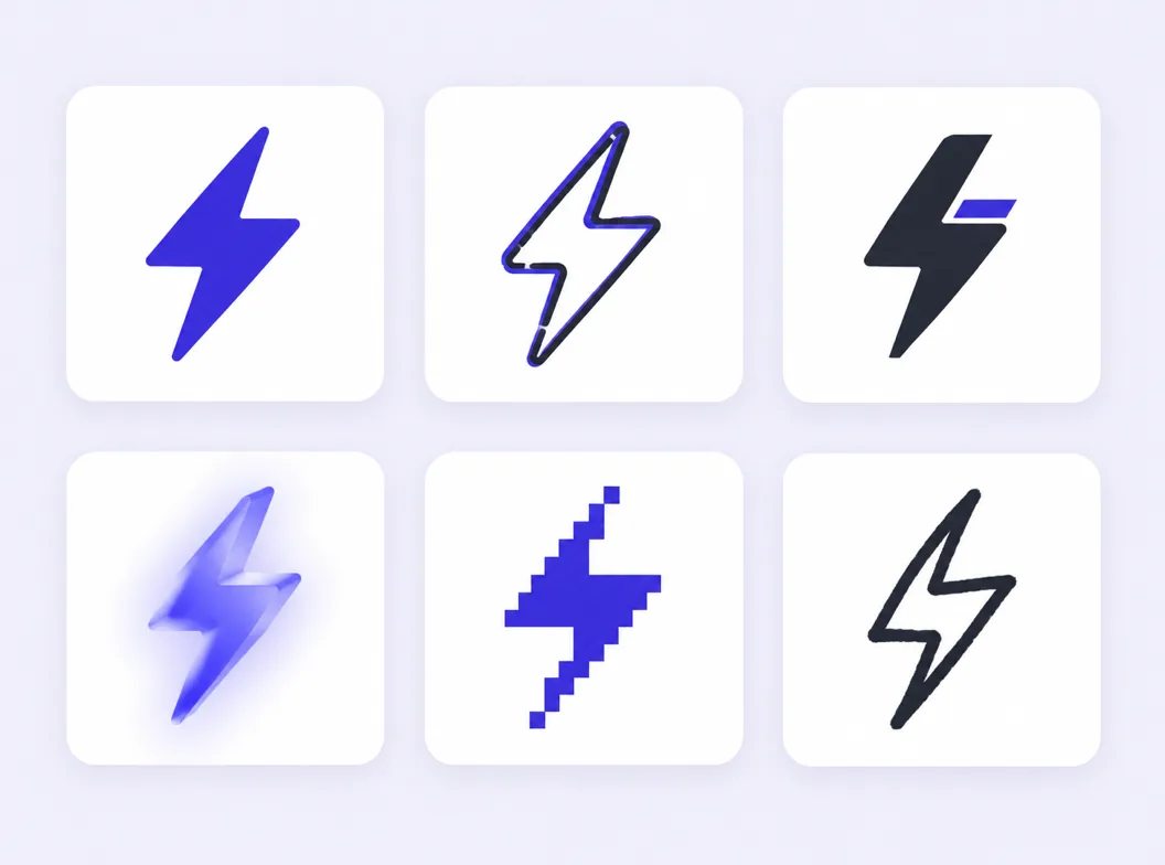
Marks generated from single prompts: flat, line, pixel and 3D directions that keep a clean silhouette from the 1024 px master down to a 16 px favicon.


What Is Icon Design?
Icon design is the practice of drawing a graphic symbol that stands for an object or an idea: a camera for the photo library, a magnifier for search, a shield for privacy. A good icon survives three filters. It is recognized before it is read, it shrinks without falling apart, and it sits next to its neighbors without clashing. Traditional training spends weeks on grids and stroke weights before the first mark ships. An AI workflow compresses that loop: describe the concept, generate candidates at 1024 px, keep the different versions side by side on the canvas, and let the small-size preview settle the argument. You still make the design decisions, one concept, one silhouette, one palette, but you make them against real marks instead of blank artboards.
One Concept per Mark
The prompt names one idea, not a scene. A mark that means two things reads as neither at 24 px, so every strong mark starts by choosing the single concept.
Judge at Real Sizes
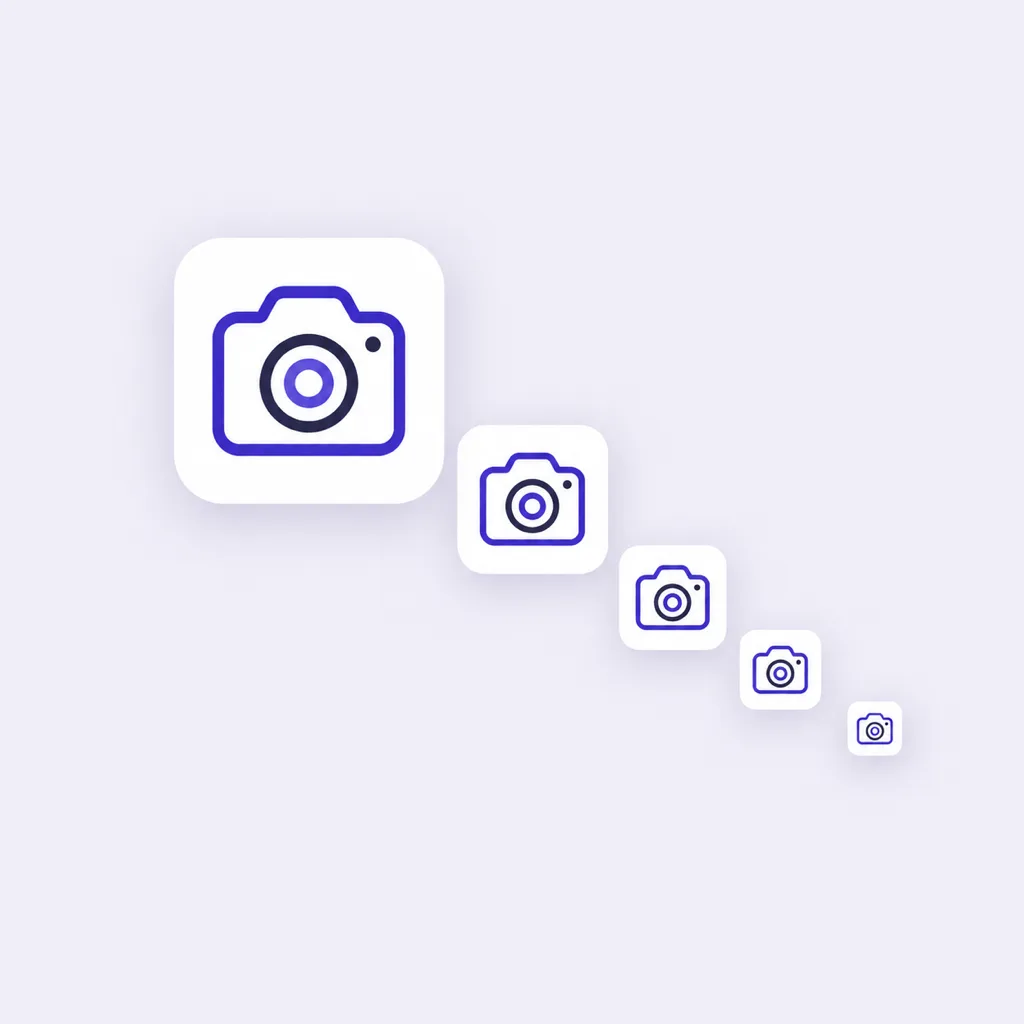
Candidates are generated at 1024 px and previewed at 48, 32 and 16 px, because an icon that only works large is an illustration, not an icon.
Versions Stay on the Canvas
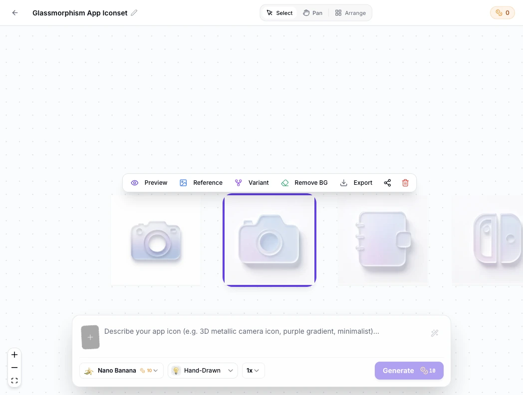
Every generation lands as a node with its prompt attached, so you can branch a direction, compare takes, and return to an earlier one without redoing work.
Icon Design Prompt Examples
Copy any of these into the generator, then swap the subject for your own. A strong prompt here names three things: the concept, the style family, and the background treatment, because those three decide how the mark scales.
Flat utility glyph
flat icon, single bold lightning bolt, one amber shape on a deep charcoal background, generous margins, readable at 16 px, no text
Line interface mark
outline icon, compass with a needle, 2 px uniform stroke, indigo on white, open negative space, crisp at 24 px, no text
3D store master
3D icon, faceted crystal on a soft gradient background, soft studio lighting, bold silhouette, centered composition for an app store master, no text
How to Design an Icon in 3 Steps
From a one-line concept to a master file that covers the store listing, the app UI and the favicon.
- 1
Describe the concept
Write one sentence that names the concept, the style family and the background, like "flat icon, bold anchor, navy on cream, readable at 16 px". The more specific the silhouette, the fewer rounds you need.
- 2
Generate, then judge small
Generate candidates at 1024x1024 and switch to the 48, 32 and 16 px previews before picking a favorite. Most icon mistakes, crowded detail, thin strokes, off-center balance, only become visible at the sizes the icon will really render.
- 3
Branch the winner, export everywhere
Keep the winning take on the canvas, branch it if you need a different weight or palette, then export PNG, ICO and WEBP from the master in the sizes each surface requests.
Icon Types and Where Each One Works
Most icon decisions start with a type. This table matches the six common families to the surfaces they serve, and records how each behaves when the master shrinks.
| Icon type | Best for | Behavior at small sizes | Typical surfaces |
|---|---|---|---|
| Flat | Bold single-concept marks in one or two solid colors | Holds at 16 px while the silhouette stays simple; detail is the enemy | App store icons, feature grids, empty states |
| Line (outline) | Interface chrome that must feel light and neutral | Crisp at 24 px and above; below that, strokes close up, so weight the stroke up before shipping a favicon cut | Toolbars, menus, settings, onboarding |
| Filled glyph | Dense information that must read in one glance | Solid shapes survive 16 px well; keeps working where line icons blur | Map pins, file types, status indicators |
| 3D | Hero marks that carry personality on a listing page | Strong at 512 and 1024 px; detail dies under 48 px, so pair it with a flat cut for small surfaces | App Store and Google Play masters, landing headers |
| Pixel | Retro games and developer tools with a technical voice | Built on the small grid, so it is exact at 16 px by construction | Game icons, emulator UIs, dev tooling |
| Hand-drawn | Craft, food and education brands that want warmth | Organic lines soften below 24 px; keep one bold shape per mark | Brand marks, packaging, illustration sets |
Small-size behavior observed on generated 1024 px masters downscaled to 48, 32 and 16 px in SparkIconAI previews, September 2026.
Choose a direction from the table, describe it in one sentence, and check the result at 16 px before committing.
Open the Icon Design GeneratorIcon Design Across a Product
One icon design effort serves three layers of a product, and each layer asks for a different cut of the master. Have a finished square already? The free app icon resizer cuts it into every size without a new render.
The same concept, cut three ways
A store master, an interface mark and a favicon can share one silhouette. Design the strong version first at 1024 px, then let the small cuts inherit its shape instead of redrawing it.
App icons for the stores
The listing icon is the loudest surface: a 1024 px master for the App Store and a 512 px asset for Google Play, generated from the same prompt as the rest of the set.
Interface icons inside the app
Navigation tabs, toolbars and settings rows render at 16 to 32 px, which is where icon quality is really tested. Line and filled families with one stroke weight keep a UI calm.
Favicons and the web
The favicon is the smallest cut of the family: 16 and 32 px in a browser tab. If the mark survives there, the rest of the design is in good shape.
Three Ways to Design Icons
An AI generator, a stock icon library and vector design software all end at a folder of files. They differ in who draws the mark, how much control you keep, and what happens when you need a different version.
| AI icon generator | Stock icon libraries | Vector design software | |
|---|---|---|---|
| Starting point | A sentence describing the concept and style | Search terms, then filtering | A blank artboard and a drawn grid |
| Control | Direction through prompts and reference images; every candidate regenerable | None; you take the mark as published | Full control of every anchor point |
| Getting a different version | Branch the mark on the canvas and generate more icons in the same style | Search again and hope a lookalike exists | Redraw it, or pay for the variation |
| Time per mark | Under a minute per concept | Minutes of searching per icon | Hours per polished set |
| License | Commercial rights to every icon you generate | Varies by library and plan, attribution sometimes required | Yours, since you drew it |
| Export to platform sizes | Built in: master to store and web sizes in one pass | Manual resizing in another tool | Manual export actions and asset pipelines |
Comparison of typical workflows for custom icon work and library licensing, verified as of 2026.
What the Generator Handles for You
Everything between the first sentence about a concept and a master file that ships to every surface.
Prompt to master in one pass
Describe the concept and style, and get a 1024 px candidate in under a minute, with 18+ style families one click away.
Reference-image matching
Upload an existing icon and new generations follow its look, which keeps later additions inside the look you already approved.
Different versions of one concept
Branch a mark into weight, palette and style takes, compare them side by side, and keep the winner without losing the runners-up.
Small-size checks
Preview every candidate at 48, 32 and 16 px, the sizes where icons succeed or fail quietly.
Exports for every surface
PNG, ICO and WEBP from one master, with transparent or solid backgrounds per surface and store-ready size sets.
A workspace that remembers
Generations stay on the canvas with their prompts, so the whole session can resume next week exactly where it stopped.
Icon Design Styles, from Flat to Pixel
Style is the loudest decision when designing icons: flat families ship the boldest silhouettes, line families keep interfaces quiet, pixel and 3D families carry a strong point of view. Compare directions on finished marks in the icon style gallery: the line, pixel and 3D pages show each family on real icons.
Design Rules That Make Icons Work
Four rules cover most of icon design work. Draw one concept per mark, because a mark that means two things reads as neither at 24 px. Test at 16 px early, since the tab strip and the toolbar are where weak silhouettes collapse. Keep margins generous on the master, because platforms crop and round corners differently. And generate more icons than you need, three takes minimum per concept, since the first idea is rarely the strongest and comparison is how taste gets applied.
Where the Workflow Fits
One generator behind every icon a product ships, from the store listing to the browser tab.
Store-ready app icons
The 1024 px App Store master and the Google Play 512 px asset, generated from one concept.
Style-first directions
Explore 3D marks when the flat direction feels flat, on the same canvas.
A matched family for the brand
Take the design language across the app, site, deck and support pages.
Feature grids of eight
A consistent set of 8 icons for the landing page, one prompt family.
Favicon and web cuts
favicon.ico, apple-touch-icon and the PWA sizes from the same master.
Browse finished marks
See how concepts, styles and palettes hold up on real icons before writing your prompt.
Related Tools
Blog
Further Reading
Longer reads on icons, styles and export workflows.

Icon Design FAQ
What icon design covers, which type to pick, and the questions first-time designers ask before generating.
What is icon design?
It is the practice of drawing a graphic symbol that stands for an object or an idea, from a camera meaning photos to a shield meaning privacy. The work covers choosing one concept, giving it a silhouette that reads instantly, and making sure the mark survives every size it will render at, from a 1024 px store master down to a 16 px favicon.
How do I design an icon with AI for free?
The generator above starts with free credits: describe the concept, generate the first candidates, and check them at small sizes before paying anything. Further generations use credits, and every plan includes all styles and export formats.
What makes a good icon?
Three things: it is recognized before it is read, it shrinks without falling apart, and it sits beside its neighbors without clashing. In practice that means one concept per mark, a simple bold silhouette, a restrained palette, and a check at 16 px before shipping.
What are the different types of icons?
The six common families are flat, line, filled glyph, 3D, pixel and hand-drawn. Each earns its keep on different surfaces: flat ships the boldest store marks, line keeps interface chrome quiet, filled glyphs survive the smallest sizes, 3D carries personality on listing pages, pixel fits retro games, and hand-drawn warms up craft brands. The types table above matches each to its strongest surfaces.
How do I get different versions of the same icon?
Generate the concept once, then branch the result on the canvas: same subject, different style, weight or palette. Every version stays linked to its prompt, so you can compare different takes side by side and keep more than one candidate alive while you decide.
How do I make more icons in the same style?
Reuse the same style, palette and stroke description across prompts, and upload one approved mark as a reference image so new generations follow its look. That is how a set grows from one icon to more icons without style drift.
What size should I design an icon at?
Design the master at 1024x1024, then let every smaller size come from it. Judge the result at 48, 32 and 16 px, because those are the sizes interfaces really render, and export cuts per surface: 1024 px for the App Store, 512 px for Google Play, 16 to 48 px for favicons.
Can one master serve the app icon and the favicon?
Yes, when the silhouette is simple enough to survive 16 px. Generate the strong 1024 px version first, preview the 16 px cut, and simplify the shape rather than the idea if it blurs. The favicon is the smallest reduction of the family, not a separate design.
Do I need design experience to design icons here?
No. The prompt carries the vocabulary: name the concept, the style family and the background, and the generator returns candidates you can judge with your eyes. Design experience helps you name what is wrong, but the small-size previews catch most issues for you.
Can I use my designed icons commercially?
Yes. You keep full commercial rights to every icon you generate, subject to the terms of service, including icons used in shipped products, store listings and client work.
Start Your Icon Design
Describe the concept in one sentence, generate the master, check it at 16 px, and export every size your product needs.