
Icons for Branding: Generate Your Brand Icon Set from One Prompt
A brand does not need a thousand icons. It needs a small family that looks drawn by one hand: the app mark, the favicon, the feature icons on the landing page, the glyphs in the help center. Describe your brand in one sentence and generate icons for branding that share one style, one palette and one stroke weight, then keep the whole family on a single canvas as it grows.
Brand Icon Examples
Families generated from single prompts: line, minimalist and hand-drawn marks that hold one palette and one stroke weight from a 1024 px master down to a 16 px favicon.


What Are Icons for Branding?
Brand icons are the small symbols that stand for processes, features and objects across everything a company ships: the app icon, the favicon, the feature grid, the pricing table, the support pages. They are not the logo, they are the vocabulary around it. Most teams collect that vocabulary one download at a time from stock libraries, and the mismatch shows: mixed authors, mixed stroke weights, a set that never quite belongs together. A branding icon generator starts from your side of the table. You describe the mark in plain words, pick a style and a palette, and generate a family that shares one parent. Each icon lands on the infinite canvas as a node, so you can branch a mark into weights and colors, compare every candidate at 16 px, and keep the approved family linked to the prompts that produced it.
One Prompt Family
Generate every brand icon from the same style, palette and stroke description, so new marks join the family without a style drift.
Reference Keeps It On-Brand
Upload your existing app icon or any family member, and new generations follow its look instead of inventing a new one.
Built-in Post-Processing
One-click background cutout and solid fills, so a mark lifted from the canvas sits clean on landing pages and deck slides.
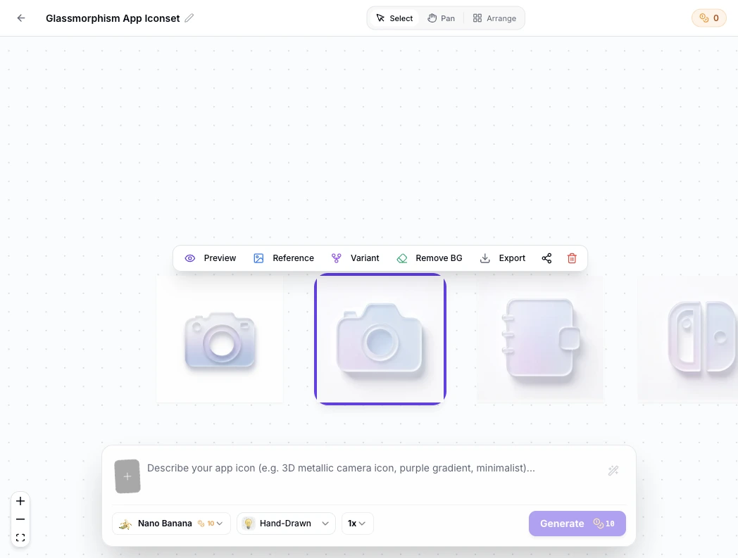
Brand Icon Prompt Examples
Copy any of these into the generator, then swap the subject and palette for your own brand. A strong branding prompt names three things: the subject, the style family, and the palette with stroke weight, because those two carry consistency across the whole set.
Fintech line family
brand icon, minimal line style, card and coin glyphs, 2 px uniform stroke, indigo and slate two-color palette, plain white background, no text
Warm bakery set
brand icon, hand-drawn style, wheat and croissant glyphs, slightly imperfect organic lines, wheat gold and cocoa palette, cream background, no text
Support and help family
brand icon, flat minimalist style, headset chat and lifebuoy glyphs, single teal accent on charcoal, thick silhouettes readable at 24 px, plain background, no text
How to Make Brand Icons in 3 Steps
From one sentence about your brand to a matched family that covers the app, the site and the help center.
- 1
Describe the family
Write one sentence that locks the style and the palette, like "minimal line icons, 2 px stroke, indigo and slate, for a budgeting app". Every icon you generate afterwards reuses that sentence, which is what keeps the set together.
- 2
Generate, then judge small
Generate each mark at 1024x1024, then check it at 48 px, 32 px and 16 px. Brand icons spend most of their lives beside menu items and feature bullets, so the small preview is the real review.
- 3
Lock the winners, export everywhere
Keep the approved marks on the canvas, branch the ones that need another pass, and export PNG, ICO and WEBP in the sizes each surface needs. The table below lists the usual ones.
Brand Icon Surfaces and Sizes
One family serves every surface below. The sizes are the ones these surfaces request most often, and the consistency rule is what keeps them reading as one brand.
| Surface | What the surface needs | Typical sizes | Consistency rule |
|---|---|---|---|
| App icon | One square master, then the platform sets: 1024 px for the App Store, 512 px for Google Play | 1024 px PNG master, exported per store spec | The launch icon leads the family: reuse its palette in every smaller mark |
| Favicon and PWA | favicon.ico at 16, 32 and 48 px, a 180 px apple-touch-icon, and 192 plus 512 px for installable web apps | One ICO and a handful of PNGs | Reduce, do not redraw: the favicon is the app mark cut down to one readable shape |
| Feature icons on the site | Matched marks for the feature grid, pricing rows and process steps, commonly rendered between 24 and 64 px | PNG exports at 2x the render size | Same stroke weight and corner radius on every card, or the grid reads as clipart |
| Deck and social | Marks that sit on brand backgrounds in pitch decks and social posts | 1024 px PNG, transparent where the slide needs it | Keep the two-color palette; a brand icon that changes color per slide stops being one icon |
| Support and help center | Inline glyphs beside FAQ answers, category headers and status entries, usually 24 to 32 px | Small PNGs aligned to the text line | Match the site family at one accent color, so help pages feel like the product |
Sizes follow current platform requirements for app stores, favicons and PWA manifests, checked September 2026.
Describe the brand once, check the marks at favicon sizes, then export the app, web and deck assets from the table above in one pass.
Open the Branding Icon GeneratorWhere Brand Icons Appear Across a Product
Every surface in the table reads a file cut from the same generated family. Have finished squares already? The free app icon resizer cuts them into every size without a new render.
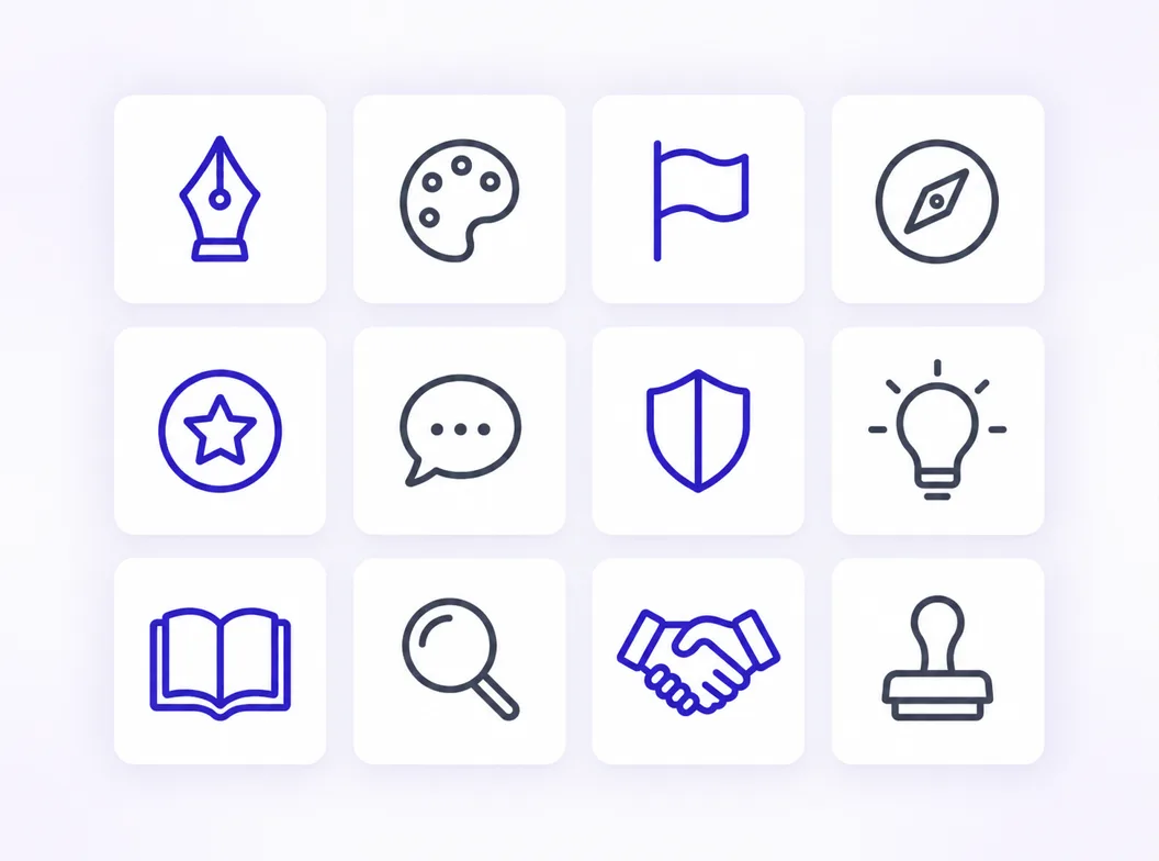
The family on one canvas
Consistency is a property of the set, not of any single icon. Generate marks from one prompt family, compare them side by side, and the shared palette and stroke weight become visible before anything ships.
Product design icons
Inside the product, icons label tabs, empty states and settings rows. Product design icons work when they follow interface logic: one glyph per concept, the family's stroke weight, and no mark that needs a caption.
Icons for support pages
Help centers, FAQs and status pages carry their own icon load: categories, contact channels, system status. Icons for support pages read best when they reuse the site family at one accent color and sit on the text line at 24 to 32 px.
The launch icon and favicon
The app icon is the loudest family member and the favicon is its smallest cut. Generate the big mark first, then reduce it: a silhouette that survives 16 px in a browser tab is a good test for the whole set.
Three Ways to Get Icons for Branding
A generator, a stock library and a freelance illustrator all end at the same folder of PNGs. They differ in who drew the marks, whether the set matches, and what happens when you need icon number nine.
| AI icon generator | Stock icon libraries | Hiring an illustrator | |
|---|---|---|---|
| Starting point | A sentence describing your brand and style | Search terms, then filtering | A brief and a kickoff call |
| Set consistency | Every mark generated from one prompt family, reference keeps later icons on it | Mixed authors and styles; matched sets are the exception | Consistent, within one illustrator's hand |
| License | Commercial rights to every icon you generate | Varies by library and plan, attribution sometimes required | Yours per contract |
| Time per mark | Under a minute per concept | Minutes of searching per icon | Days per round |
| Cost | Credits or subscription, free to start | Free tiers with limits, subscriptions for full sets | Hundreds per project |
| Adding icon number nine | Generate it later with the same prompt and reference image | Hunt for a lookalike and hope it passes | Rebook and wait |
Comparison of typical workflows and license terms for custom brand icon work, verified as of 2026.
What the Generator Handles for You
Everything between the first sentence about your brand and a matched family every surface can use.
One prompt, one family
Reuse the same style, palette and stroke description across every mark, so the set stays on-family by construction.
Reference-image matching
Upload an existing icon and new generations follow its look, which is how a set survives new designers and new quarters.
Variants without drift
Branch a mark into weight and color options on the canvas, then keep the winner linked to its origin.
Small-size checks
Preview every candidate at 48, 32 and 16 px, the sizes where brand icons spend their days.
Formats you already ship
PNG, ICO and WEBP exports from one master, with transparent or solid backgrounds per surface.
A set that grows safely
Need support icons next quarter? Generate them against the same family instead of starting a new search.
Brand Icon Styles, from Line to Hand-Drawn
Style is the contract inside a brand icon family. Line and minimalist styles carry interface-heavy brands most reliably, hand-drawn styles warm up food, craft and education brands, and flat color blocks suit marketing pages that need weight at small sizes. Compare directions on real marks in the icon style gallery: the line, minimalist and hand-drawn pages show each family on finished icons.
Design Rules That Keep a Brand Icon Set Consistent
Four rules hold most families together. Fix one palette, two colors plus a neutral, and generate every mark inside it. Fix one stroke weight and one corner radius, because the eye catches a 2 px stroke next to a 3 px sibling before it catches a wrong glyph. Draw one concept per mark, since a mark that means two things reads as neither at 24 px. And test the family as a group at 16 px, side by side, because brand icons are seen in rows, never alone.
Where the Workflow Fits
One generator behind every small symbol a brand ships, from the store listing to the help center.
Indie app identity in one sitting
Generate the launch icon, the favicon and the first feature marks in one session, all from one prompt family.
Site-wide favicon and PWA marks
Cut the same family into favicon.ico, apple-touch-icon and the 192 and 512 px manifest icons.
Feature grid for launch day
A matched set of 8 icons for the landing page grid, generated in one consistent style.
Store-ready launch icons
The 1024 px App Store master and the Google Play 512 px asset, from the same brand mark.
PNG exports for every channel
One export pass for the site, the deck, the press kit and the social profiles.
Browse finished families
See how style and palette hold across real icon families before writing your own prompt.
Related Tools
Blog
Further Reading
Longer reads on icon design, brand systems and export workflows.


Brand Icon FAQ
What brand icons are, how to keep a set consistent, and the questions teams ask before committing to one.
What are icons for branding?
They are the small symbols that represent processes, features and objects across everything a brand ships: the app icon, the favicon, feature grid marks, support page glyphs and deck symbols. Unlike the logo, which is one mark, they form a vocabulary, and they work when the whole vocabulary looks drawn by one hand.
What is the difference between a logo and a brand icon?
A logo identifies the company itself and appears in a fixed set of lockups. A brand icon stands for something inside the offer: a feature, a process, a support channel. The logo is the name on the door, brand icons are the labels on the shelves.
How do I make brand icons for free?
The generator above starts with free credits: describe the family, generate the first marks, and check them at small sizes before paying anything. Further generations use credits, and every plan includes all export formats.
How do I keep new icons consistent with my existing set?
Upload one existing family member as a reference image and reuse the original prompt's style, palette and stroke description. New generations then follow the family's look instead of drifting toward the model's defaults.
How many icons should a brand set have?
Start with the surfaces you ship this quarter: one app icon, one favicon, and the marks the landing page and help center display, often 8 to 16 glyphs. A small matched family beats a large mixed one, and the set can grow later against the same reference.
Where do product design icons appear?
Inside the product: navigation tabs, settings rows, empty states and onboarding steps, usually at 16 to 32 px. They follow the same family rules as the public-facing marks, with one glyph per concept and the family stroke weight.
What icons does a support page need?
Typically a contact channel set (chat, email, phone), category glyphs for the knowledge base, and a status indicator family. Icons for support pages read best at 24 to 32 px in the site's accent color.
Can I use generated brand icons commercially?
Yes. You keep full commercial rights to every icon you generate, subject to the terms of service, including icons used in shipped products, paid decks and client work.
What sizes do brand icons need?
The public surfaces ask for a 1024 px app master, favicon sizes from 16 to 48 px, a 180 px apple-touch-icon, 192 and 512 px PWA icons, and feature marks exported at 2x their render size. The sizes table above lists each surface.
Can I match icons to my brand colors?
Yes. Name the palette in the prompt, for example "indigo and slate two-color palette", and every generation in the family reuses it. You can also upload an existing icon as a reference so new marks follow its colors.
Generate Your Brand Icon Set
Describe the brand once, generate the family in one style and palette, and export every size the app, the site and the deck need.